For the past few days, I've heated up the discussion among the forum members on my decision, first ever made, to charge for the Malaysia Bloggers logo that I've created. Yes, I'm going to sell my artwork. Yay. As you might observe, it's not that I'm trying take a candy from a kid or whatever. I know, the Malaysia Bloggers forum is a non-profit site. And I also know, Liew is never a rich guy, pity him. It's just bad timing. If the forum were to be launched earlier, I wouldn't have made such drastic decision. No one to be blamed here.
Previously, I've chatted with a student from Multimedia University about the admission procedures and expenses. His name is Lim Cheng Koon Khoon and everyone, please give him a big applause because he could be the very first Malaysian Firefox extension author! He told me that the Faculty of Creative Multimedia is said to be the busiest faculty of all and also spend the most money. That's when I start to realise that the course that I'm most interested is one of the most expensive! He even pointed that the courses from Lim Kok Wing University College of Creative Technology are much more expensive. I try the site's online enquiry just to ask if this is true. Well, a nice guy named David Teh replied and answered my questions thoroughly. 1 year of BA (Hons) in Professional Design costs RM 17,000 and 1 year of BA in Graphic Design costs a whooping RM 22,000! He also mentioned that I can apply for the PTPTN loan, however it only covers a maximum of RM 8,000 per year. Sigh.
Art equals to money, I supposed. As web design is also my passion, I found out that all local university web sites contain invalid markup. Besides the above mentioned, there are Universiti Tunku Abdul Rahman, Universiti Tenaga Nasional, Universiti Sains Malaysia, Universiti Putra Malaysia, Universiti Utara Malaysia, Universiti Malaya, Universiti Teknologi Malaysia, Universiti Kebangsaan Malaysia and more. In my opinion, they should be ashamed of themselves! The one and only site I've visited which contains not only (almost) valid markup, yet also follows web accessibility guidelines is Monash University Malaysia. Kudos to the webmaster. Unfortunately, the expenses for Monash University is very high. I think Jinny can help me verify this fact.
I've been asking myself, should the development of a child be limited by money? I'm not sure if I'm gifted or talented in some ways. I simply want to express my creativity, that's all. Last Thursday, I've met Benjamin Leow, ate something at the char koey teow stall and had a talk. He's the guy behind the Surf7 network and was a former Form 6 student of SMK Dato' Onn, so we have much things in common. He opened up my mind about the potential of selling my artwork, especially logo designs. It's a good business. I begin to consider his offer to help me in this business, on how to earn money from my creativity.
This is when the bad timing comes. I'm going to sell the Malaysia Bloggers logo and Liew won't pay for it if there are no sponsors, donators or advertisers. Somehow, the more I read the threads in the forum, the more I notice Liew's nickname, abbreviated as 'LcF'. My brain starts to generate ideas for no particular reason and my hands get itchy. I call this the Uncontrollable Creativity Syndrome (UCS).
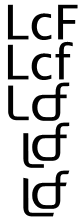
I start with 'LcF', rendered with Lucida Grande. Really, I like the Lucida font family very much. Initially, the letters 'L' and 'F' are uppercased, 'c' is lowercased, as how Liew always present it. Looking at it for few minutes, I discover some connection between 'c' and 'F', when I try to lowercase the latter. A bit of editing connects both characters, with a sense of sleek curves. I also edit the character 'L' to be more curvaceous and shifts it to a better position, under the 'cf' figure. The lower end of 'L' is lengthened for few pixels, to make the lines more consistent. The soft edges of the lines are sharpened to give it a cutting edge appearance.

I was thinking to take a much simpler approach in designing logos. Most logos I've created are too complex, using a lot of colours and graphic effects. You see, most professional logos are simplistic, such as the Fedex logo. Of course, I am not a professional so this is trivial anyway.
The flat look of the logo seems a bit weird. So, I try to mould the logo, altering its perspective grid, adding a dimension to it. The logo looks elegant and a bit modern. It's like I've seen it somewhere before, but not sure what is it. As simple as it gets, this logo is done.
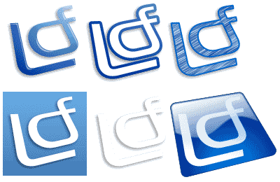
Regarding the design, I found out that the advantage of creating such simplistic logo is you can create many variations of it, depends on how good your creativity is. I played with mine and came out with six variations. Not more than six because the symptoms of my syndrome have stopped, finally.
Oh no, I've accidentally created logos for LiewCF.com. Should I sell them or should I not? Even if Liew won't be buying them, anyone with identical initials could buy them, though. Ironically, my name is abbreviated as 'LCA', only differ by one character. If not, I would have use it for my site. Haha.
Here I realised that my mind is confused. Too many things run around my grey cells. I hope anyone reading this wouldn't feel as confused as I do. Please pardon me.