Earlier this year, around the month of April, Winston asked me if I know any designers who can help designing a logo and few artwork for RedDotRubyConf 2016. It's supposedly a straightforward task of designing a logo, a booklet/pamphlet, posters, t-shirts, and stickers, that will be displayed all over the place in the conference and printed on swags to be given to the attendees in goodie bags.
The conference ran on June 23rd and 24th, so there's like at most 2 months of time to come up with something. The artwork is not to be confused with the original conference logo as it serves more like a theme that will be different every year, to give sort of a refreshing look.
For example, in 2014, there's the "Ruby man" (booklet):
In 2015, there's the Ruby with a Singapore-skyline artwork (poster):
So for this year 2016, what could it be?
Looking back
I've attended RedDotRubyConf since the first one in 2011 when it was organized by Andy Croll.
Back then, I was asking on Twitter:
Should I attend @reddotrubyconf since I don't really know Ruby/Rails?
I'm a front-end engineer and don't really code in Ruby. I've worked with a few Ruby developers throughout my career and have always been impressed by the community. I'm impressed by how Andy and a few Ruby enthusiasts manage to start and run a conference in Singapore.
Since then, I've never missed attending RedDotRubyConf. This year is the 6th year, so I've been an attendee for 6 years. And every year, I compile all the slides, photos and links into a single page. For example, this year's compilation on Github Gist, which also links to all previous compilations.
So going back to Winston's question. Do I know any designers who could help designing artwork for the conference? Perhaps a few but it depends on their time and schedule. And then I thought, why don't I give it a try myself? Winston told me that he's fine with it, as I briefed to him that if I couldn't come up with something, I can delegate other designers to him and see how it goes.
Designing the artwork
First I need to decide on a theme. I need some inspiration. I need to do some research.
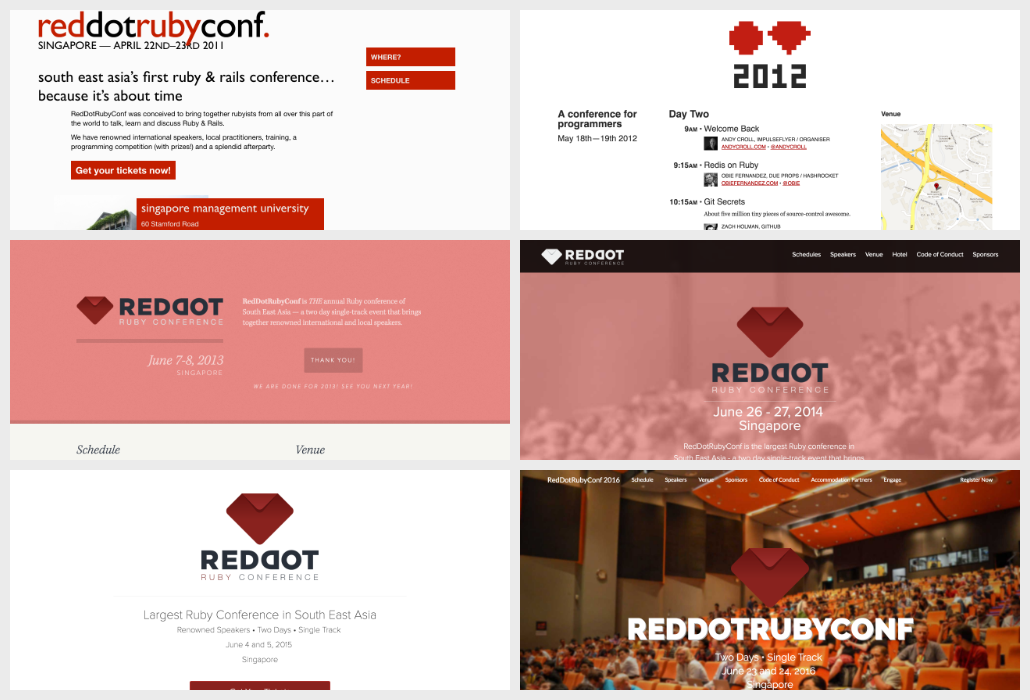
I visit the current site and look at the current logo, which looks like a folded square red paper, that forms a glyph of a ruby stone. This design has become a "standard" since 2013, which I think it's when Winston took over the organizer role from Andy. The first two years were probably experimental and I particularly like 2012's pixel art 😉
Pixel art is pretty cool. I've designed a few for KopiJS and most recently, an elePHPant, using Aseprite.
At first I thought of reviving RedDotRubyConf 2012's pixel art, but perhaps I could level it up further? I was inspired by isometric pixel art and 3D blocks, especially from games like Monument Valley and Minecraft. I was curious to know how the designers actually draw them since the grid structure is different than the standard grid of straight horizontal and vertical lines.
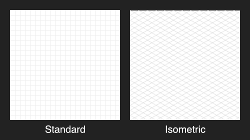
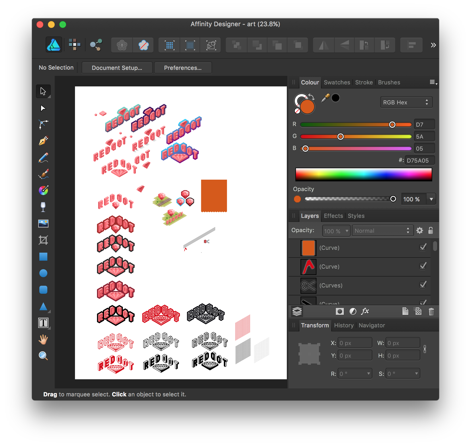
I use Affinity Designer. I tried designing isometric art with the standard grid, but realised it's really difficult to make the slanted angles consistent. I was like trying to draw a line with the angle of 30° and keep fighting with the snapping between objects and the grid itself.
I realised that I was doing this the hard way and later, I found that I could customize the grid options in Affinity Designer.
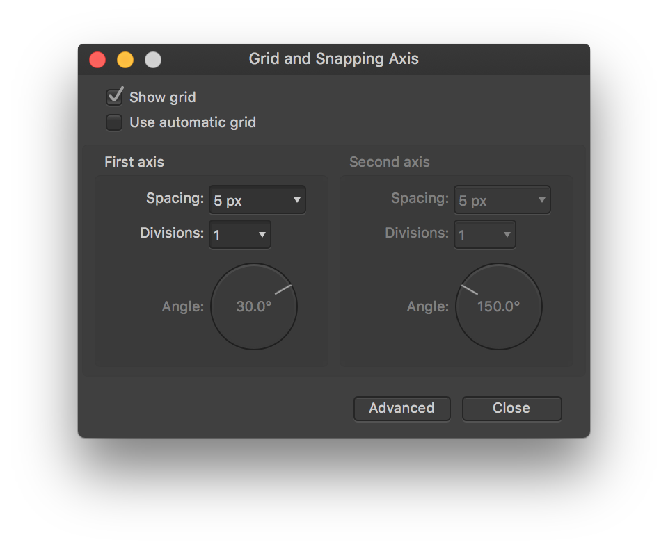
Holy cow. Suddenly I can easily create isometric art! All the snapping works perfectly and I don't need to adjust the lines and points to be in slanted angles anymore! Gosh, I wish someone told me about this earlier.
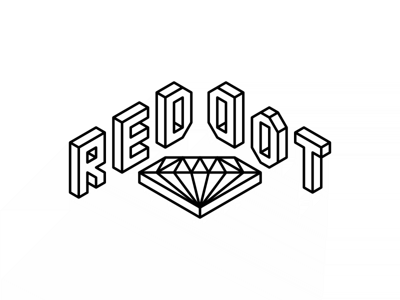
I started simple.
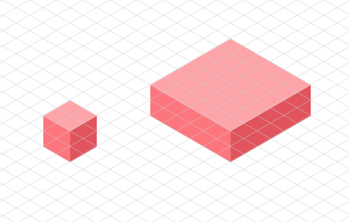
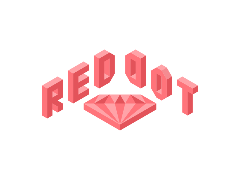
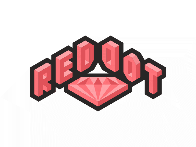
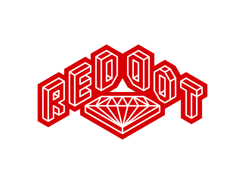
The cubes look good. The lighting and shadows look fine. I have to keep toggling the grid on and off, just to see if it looks okay. I choose the lighter and more vibrant red as the main color because I find that the original logo is a bit dark-ish. The color needs to be more fun, like playing a game. It also illustrates Ruby as a fun programming language for anyone to learn and work with. 😁
Anyway, let's start.
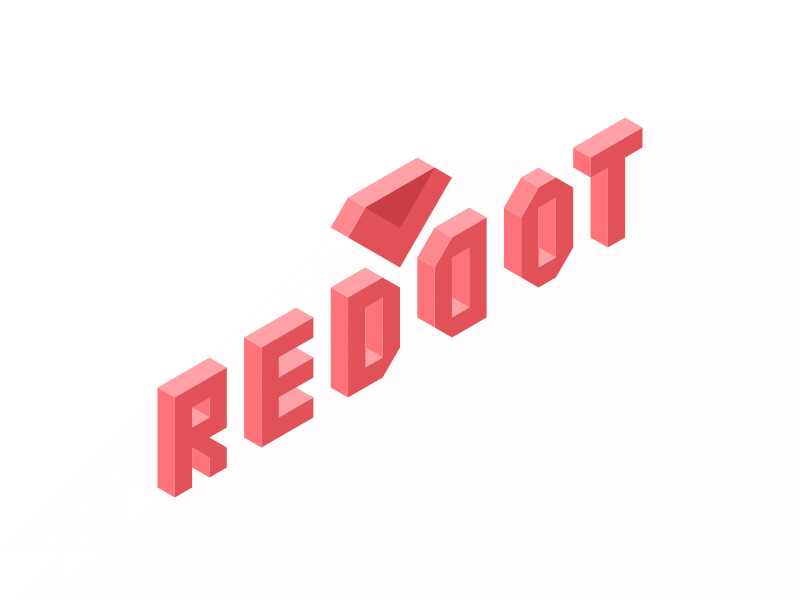
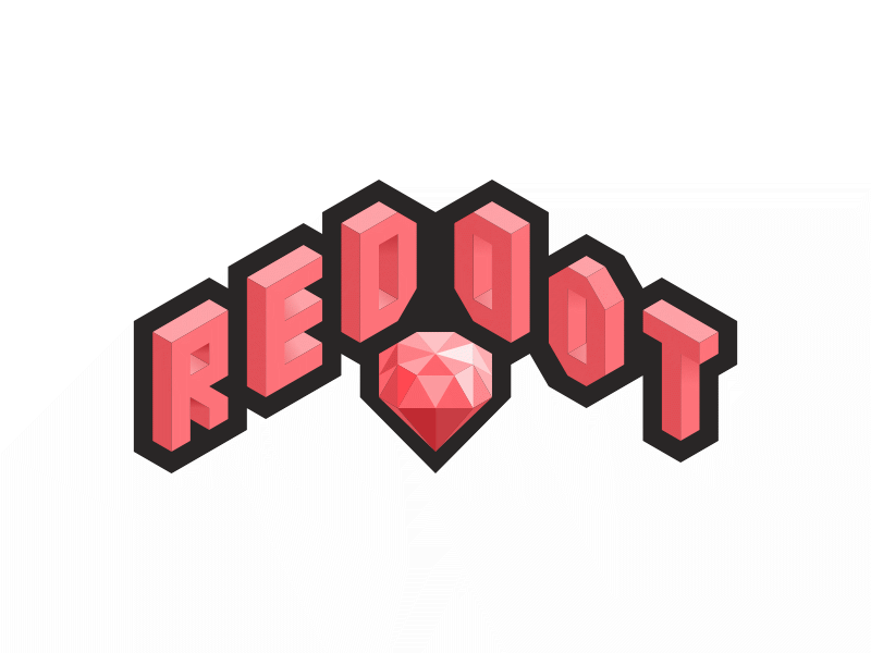
I follow the grid, and draw everything slanted. I manage to copy the original logo's folded feature into the isometric Ruby logo. I've also flipped the second 'D' to mirror the first 'D'. All the legacy features in a whole new art style.
With the overlaying isometric grid, the first version looks great. Unfortunately without the grid, it kind of looks weird. So I try to make it semi-3D-and-2D-ish. The characters and the ruby shape are in 3D and they are placed on a flat 2D background. This will look good if it's printed as stickers too.
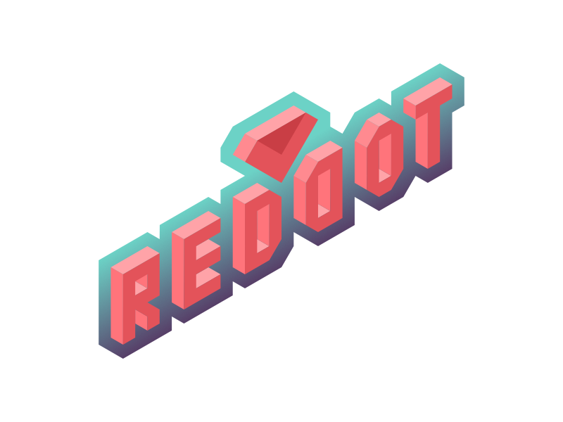
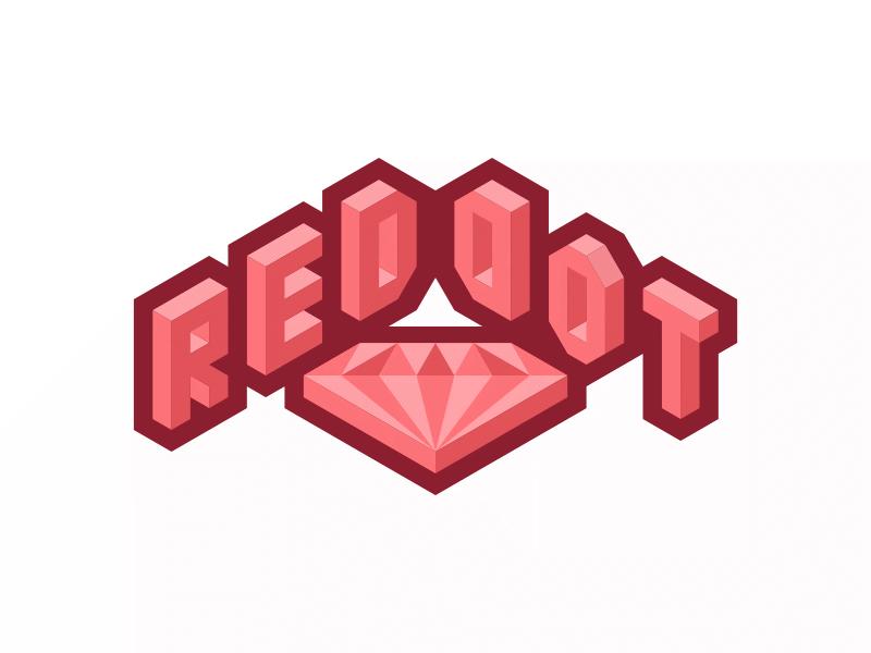
The gradient background doesn't look right, so I make it slightly darker.
I make it more flashy too.
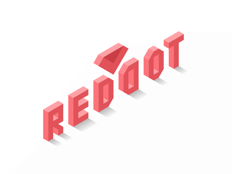
Perhaps I should get rid of the flat background and stay with the 3D perspective. So I try to add drop shadows for the characters. Notice that there's no shadow for the ruby shape because I have no idea how it would look like on the "floor" 😅
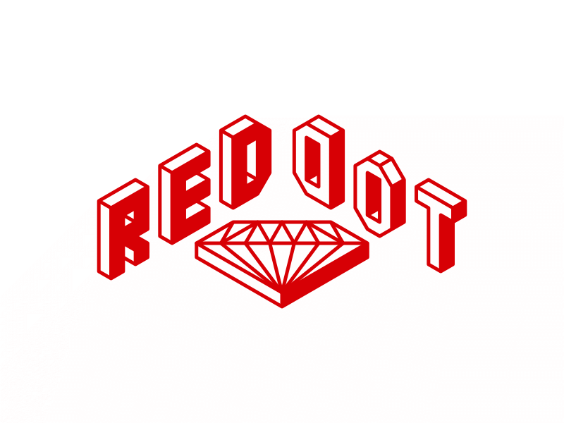
I redesign the ruby shape to be more 3D. I move down the new 3D ruby shape and flip the 'DOT' characters. Previously, it's like "Red-Ruby-Dot", but now it's more legit "Red-Dot-Ruby" 😂
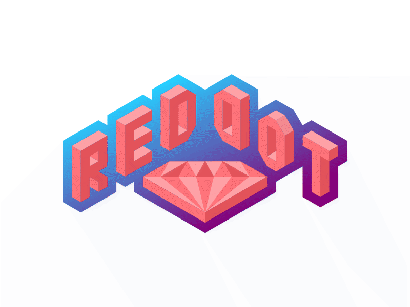
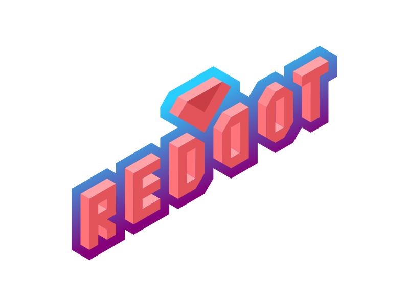
Fancy gradients again to see how it would look like.
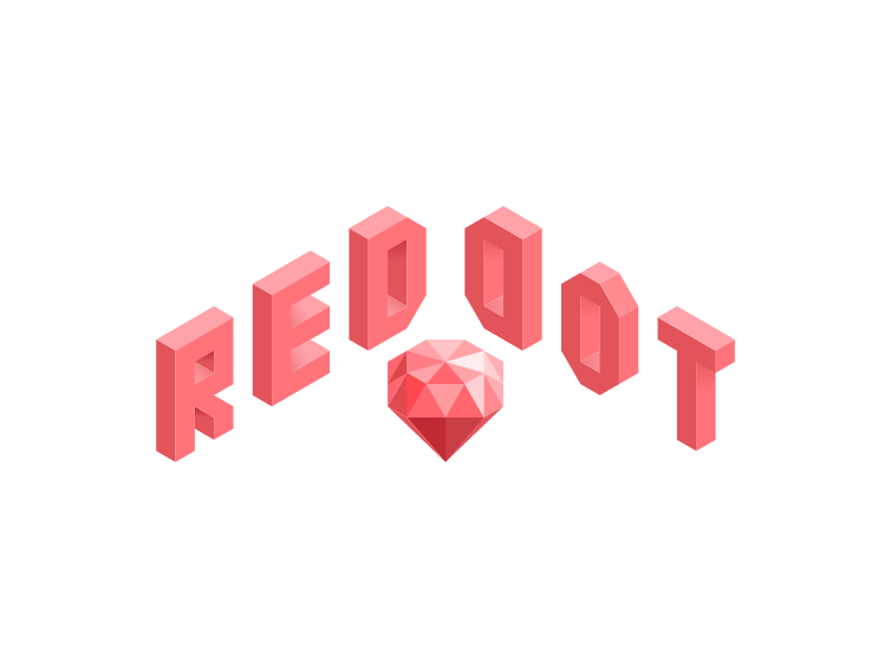
I couldn't resist making the ruby shape even more 3D. Like this ruby stone floating in mid-air.
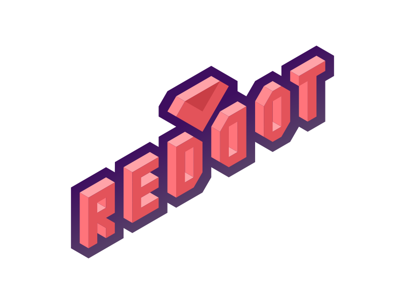
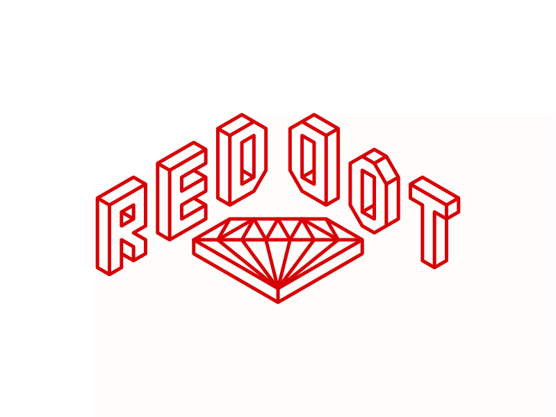
Let's try a flat backdrop outline, instead of the fancy gradients. Red on red? 🙄
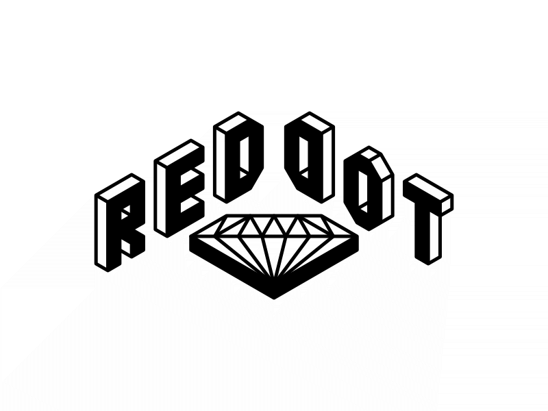
How about dark grey? Looks pretty sharp there. The logo pops out and shouts at you.
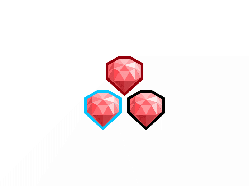
Maybe I should get rid of the 'RedDot' characters and just focus on these beauties? 😍 Experimental outline colors there.
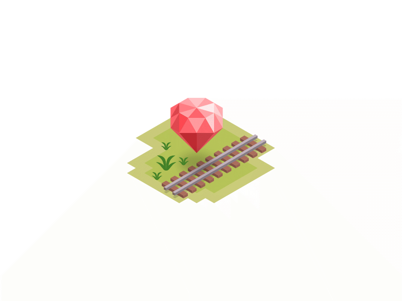
How about… Ruby on Rails? And a few patches of grass? Oh, look at that drop shadow casted by the floating ruby stone! 😍
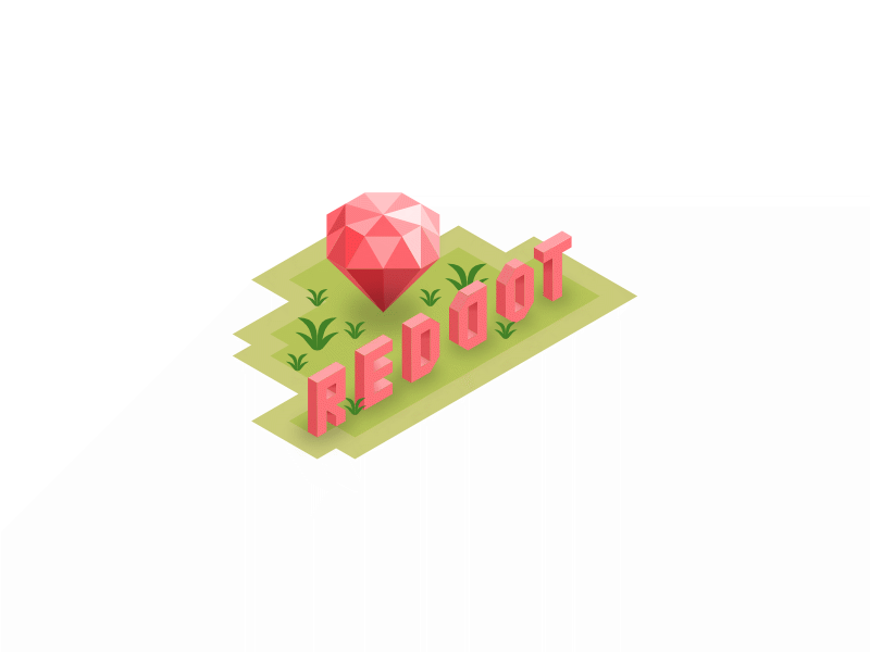
Okay, it's a Ruby conference, so putting the train rails is making it too specific. There's RailsConf for that. So I put back the old 'RedDot' characters on top of the grass patches. And more grasses!
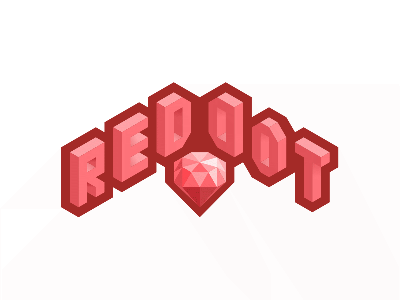
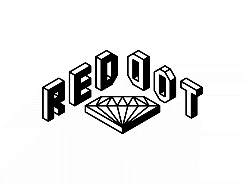
Let's get back to this. I think I played around too much 😅. I apply the gray outline to the second iteration instead. Notice the hole punch in the middle.
Red outline?
Jet black?
Winston asked me if the logo can be made in a single color due to printing limitations. I almost forgot about that because logo design usually need to work in multiple scenarios, especially for business owners to print on paper with black and white or monochrome printers. Since this is a 3D-ish design, I set everything into a single color and redraw all shapes with only the strokes.
Looks sharper with black?
I reintroduce the darker shade on the characters, at least retaining its 3D perspective.
Black again.
Instead of dropping the darker shade on the bottom right side, I try do it at the bottom instead.
I add an outline and inverse the whole thing. Now it looks bold.
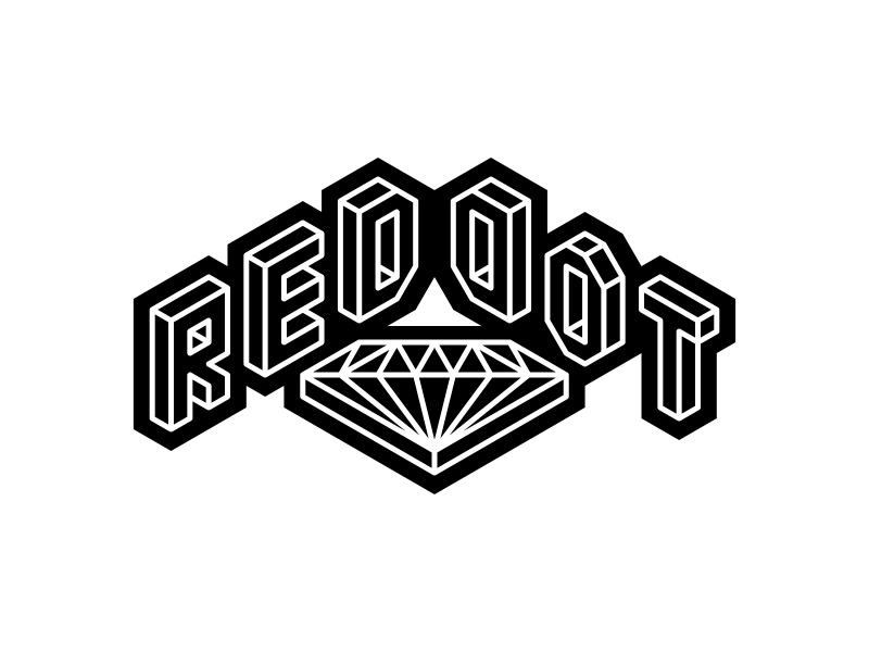
Black, as always, shows a deep sense of elegance and seriousness 😎
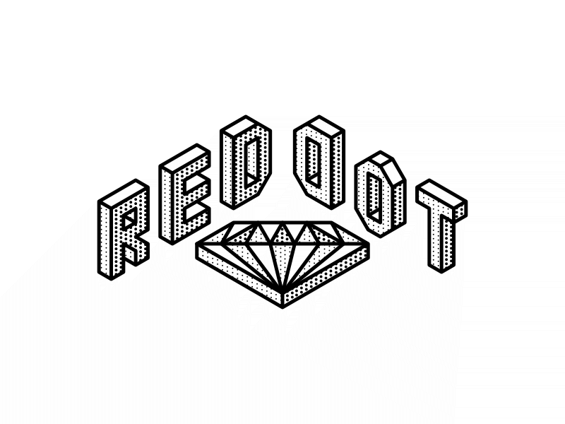
One way to simulate multiple shades or gradients in a single color, is to use the halftone technique, which I'm inspired by comics. I try it out and I think it doesn't look bad at all. It's not easy creating this effect though as I have to create the dots pattern, perform layer clipping on every section of the 'blocks' and align the dots together in some form of invisible grid.
Implementing the artwork
Fortunately, Winston accepted my design, though obviously, not all the designs were accepted in the final round. Some got in, while some were sneakily shoved in.
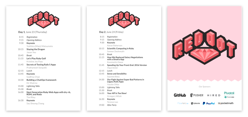
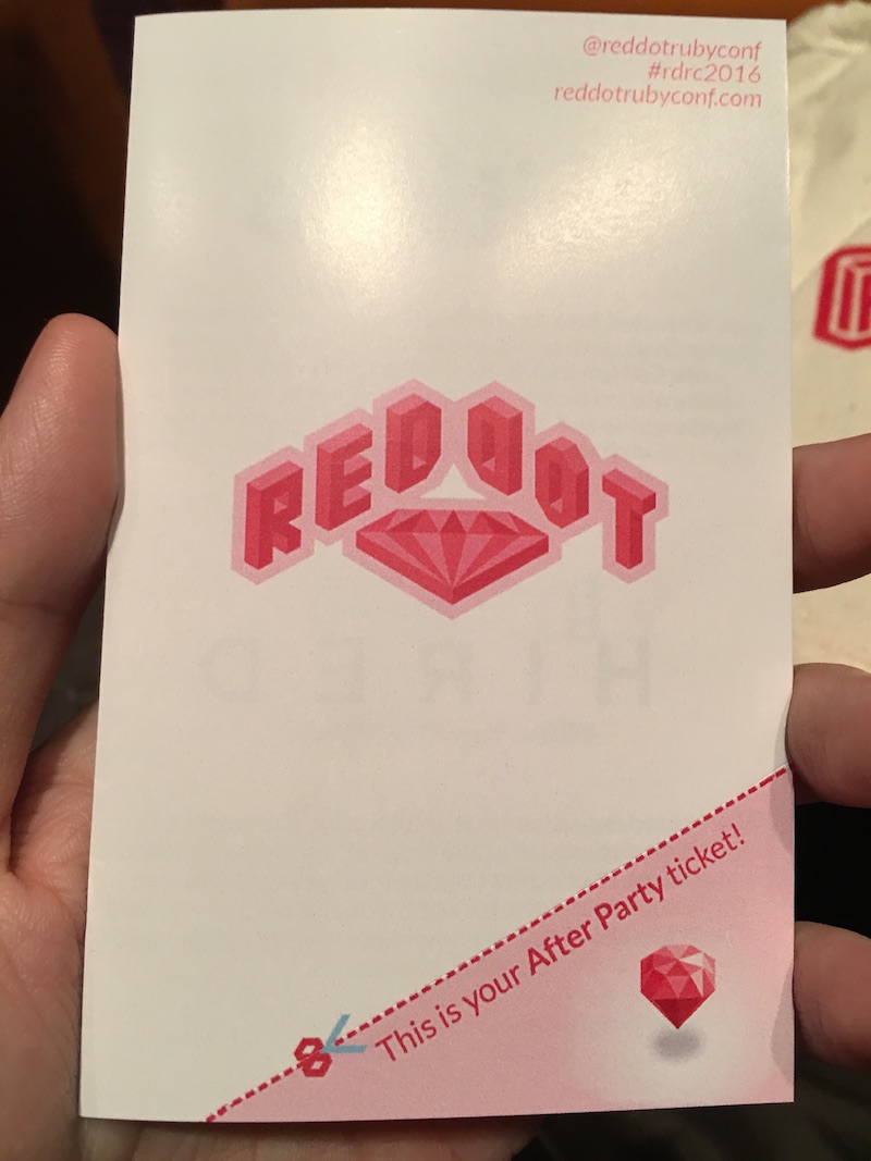
This is the design for the booklet:
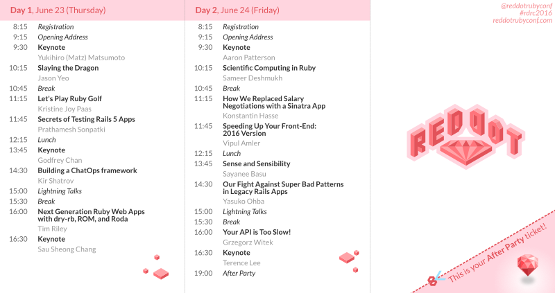
This is the front-side while the other side will show all the sponsor logos and text. It's a tri-fold booklet.
Notice the cube blocks that I drew in the beginning? And the 3D ruby stone for the after-party ticket which is part of the booklet itself with a cut line. The logo has a light red outline so that it doesn't catch too much attention. Bold text for the talks, italic text for non-talk sessions, and grayed text for speaker names. Oh, the scissors are designed on an isometric grid too.
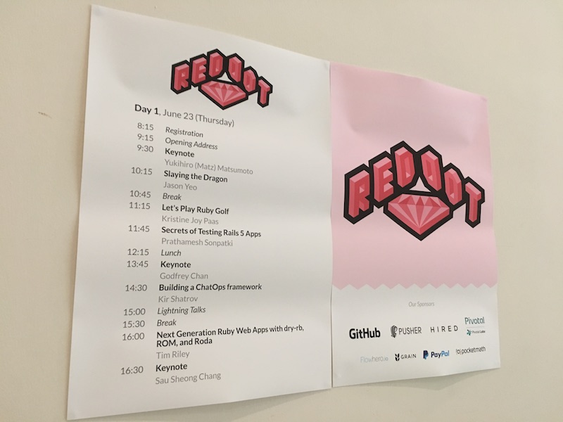
The posters get a similar treatment. Simple and clear.
To be honest, I really like the isometric zigzag edges in the 'Sponsors' poster. It reminds me of something but I have no idea what is it.
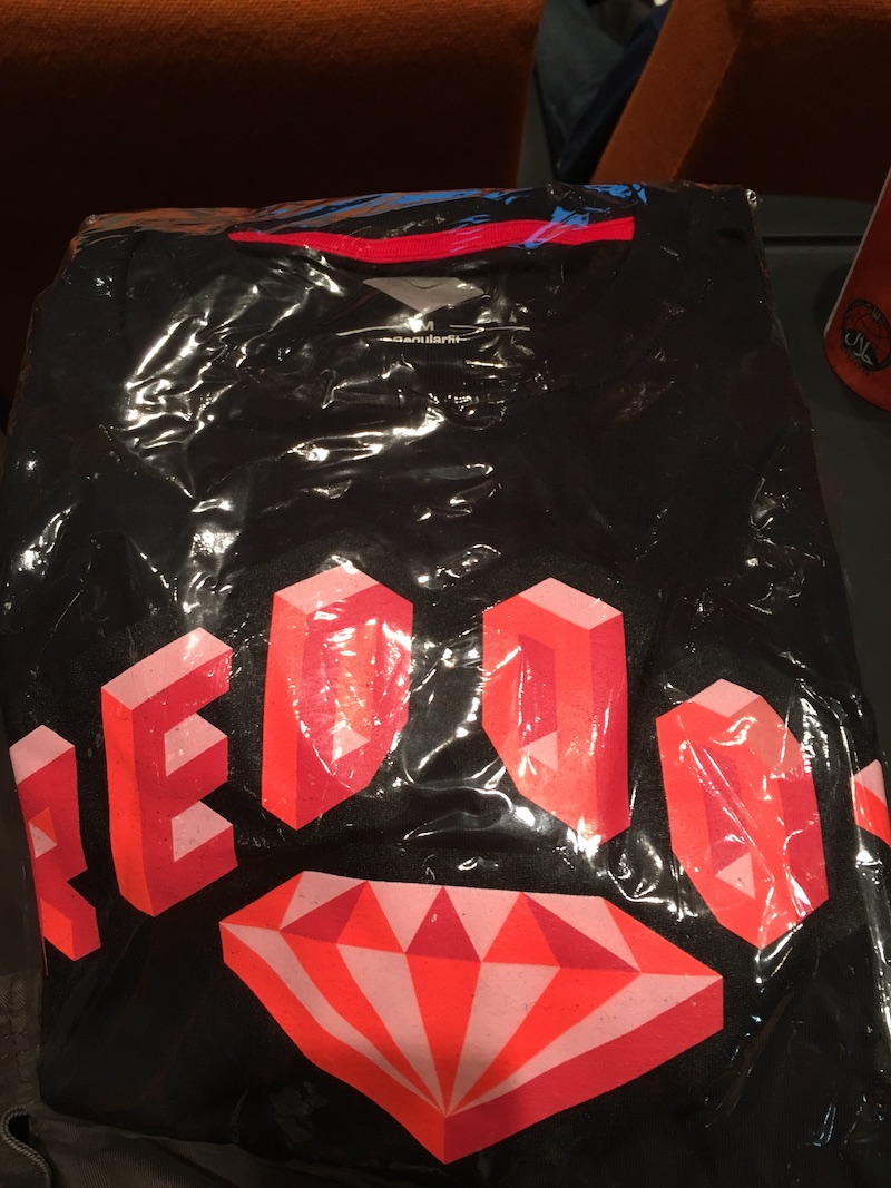
Most important of all, the t-shirt designs:
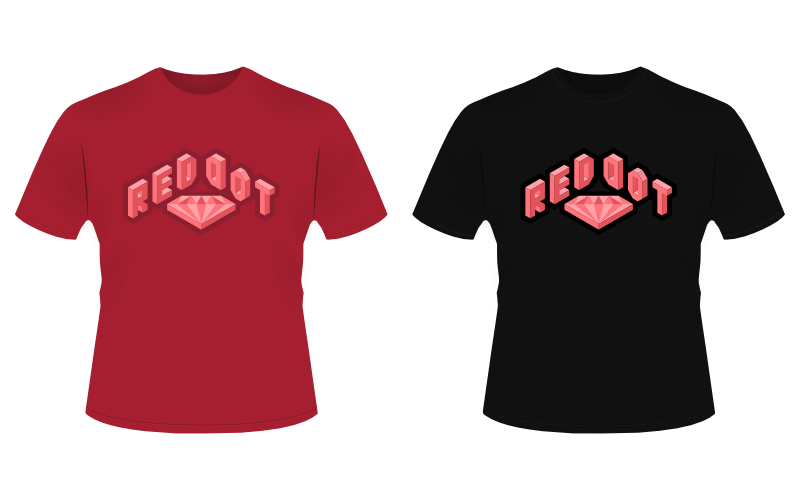
Red shirt for the volunteers. Black shirt for the attendees. Striking logos for both. And a small disclaimer that these t-shirt vectors are designed by DanRabbit.
There were a few more goodies and stuff that I don't have to mock-up, such as the handy notebook, the dried fruit packet, attendee stickers (not lanyards), and the goodie bag itself.
Even if I manage to mock them up, it's pretty difficult to see how it would look like in real world. The booklet could be smaller than what I thought, so I would need to increase the text size so that it would be readable. The goodies might get too expensive if I use too many colors, probably due to the vendor charging by number of colors or something. I need to know the actual red or black color of the shirts so that I can adjust the logo outline to match the shirt color. The conference schedule might change, so I probably need to update the booklet and the posters (it did change last minute though 😅).
During the course of 2 months, I really enjoy exchanging ideas with Winston, as I know that he has a pretty good design sense too, despite both of us being known as engineers 😉 All the iterations wouldn't be possible without his feedback and suggestions, which ultimately makes the whole process more fun and enjoyable for me.
The day has come
On June 23rd, I attended the conference in anticipation to see my designs materialize as real-world objects. I've already seen a few photos taken during the preparation for the conference, but seriously, nothing beats the real thing.
I suppose, pictures speak louder than words 📸
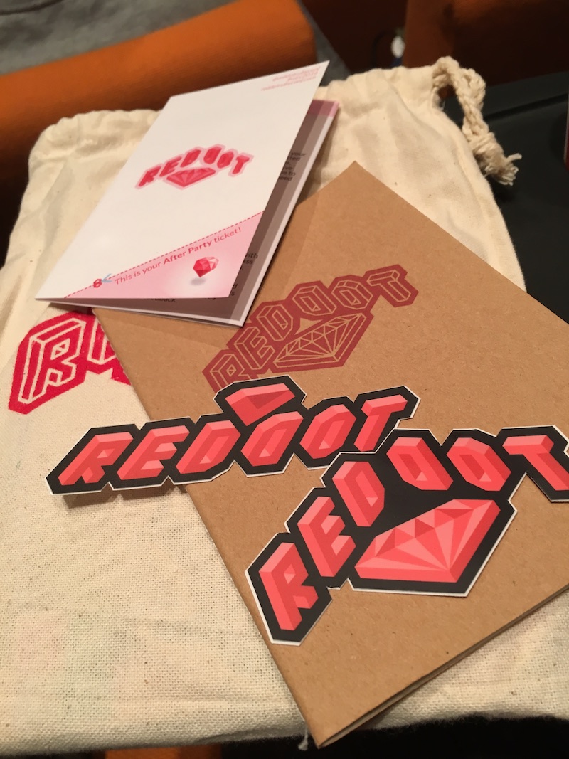
The stickers, tri-fold booklet, and the goodie bag.
The t-shirt:
The posters:
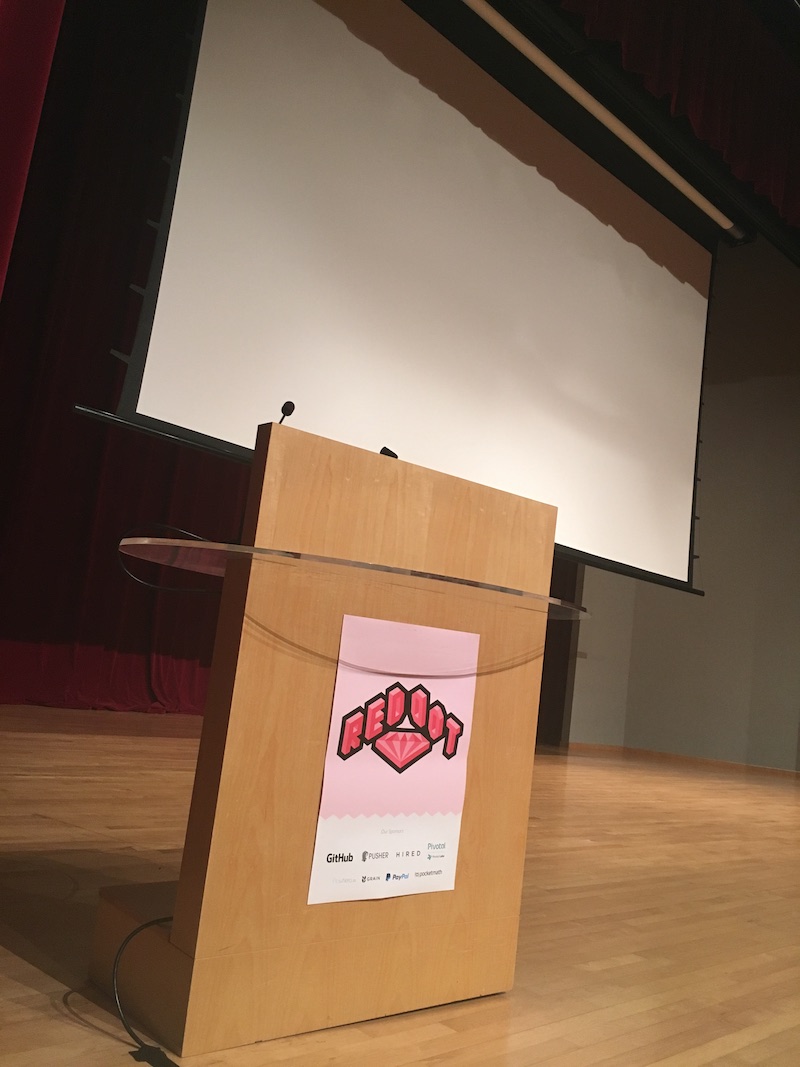
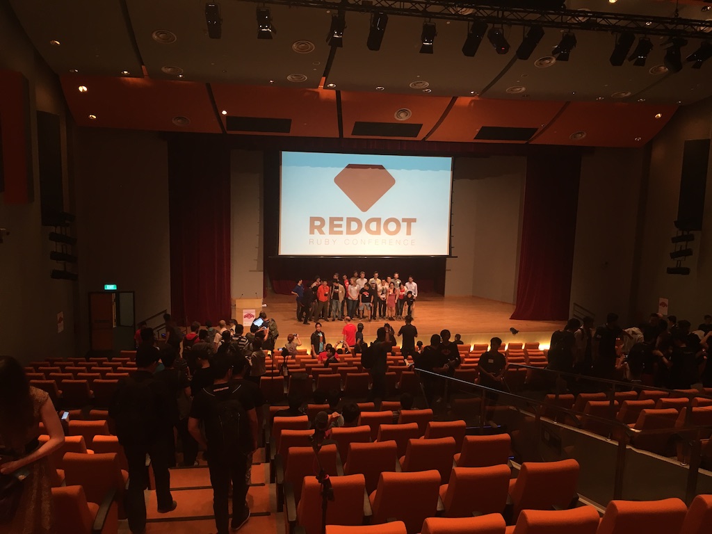
Look at the projected logo from the back of the conference hall!
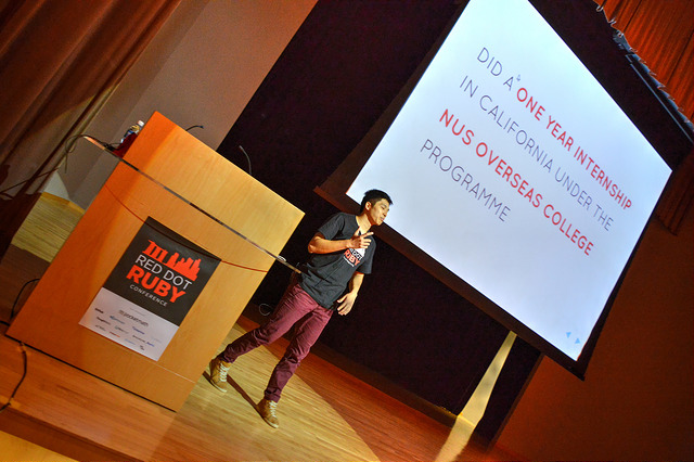
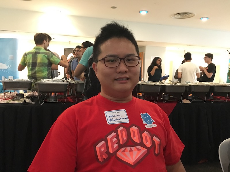
The awesome Juanito Fatas, from Taiwan, wearing the red t-shirt:
The one and only, Winston, wearing the black t-shirt:

It's quite an incredible experience for me, as I hear a few positive feedback from people who realised that I'm the one who designed the logo.
Some of them started asking me how did I learn design? Well… it's a long story 😉
The aftermath
Honestly speaking, even after the conference is done, I still have the feeling that I'm not fully satisfied with the artwork.
Probably I didn't spend enough time on it. Probably it needs more details and slight color changes somewhere. Perhaps I could experiment with the grid further and discover some unknown perspectives of the logo. Perhaps I didn't have the chance to tweak the design to accommodate the printing and color limitations on the t-shirt. It could have been better in ways that I couldn't even imagine.
Nevertheless, I believe that I've tried my best and did a decently good job. I should probably do this again for next year's RedDotRubyConf or even other conferences 🤔
About 2 months after the conference, Winston wrote his RedDotRubyConf 2016 review and I've open-sourced all the design source files on GitHub.