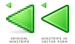
I've been looking at Winstripe, pixel by pixel. I feel like want to do some detective work on it. If you roughly take a look at the icons, they feel too much like those icons taken from older Windows, including Netscape 4, I guess. Just that these are more colourful, not limited to 4-bit colour palettes. If only Windows XP hasn't been released three years ago, I bet these icons would be very popular by then. I tried zooming in the icons, and notice few anti-aliasing pixels. That makes me wonder if these icons are really created from vector form, despite its pixelated design.

Anyway, I recreate the Winstripe Back icon in vector form. Of course, it looks almost the same as the original one. Now, we can clearly see the equilateral triangles. I left out the shadow because it's a pretty minor decoration that is neglectable. Some Firefox users don't like the shadow effect. Some of us might argue if the shape is intuitive enough for its function. The arrow shape is a better choice, most of the time. Current versions of Internet Explorer and Opera use arrows. Arvid's Qute and my Phoenity use arrows too. Ironically, Safari and Pinstripe use triangles. Kevin wrote that the Winstripe icons are taken from Pinstripe and recast in a Windows style. Whatever Windows style it is, does that mean the triangle shape has to stay?

Okay, I don't change the shape, instead I add a circle around it. The Luna Back or Forward icon has a circle around its arrow. I design the circle with the Winstripe styles, which is to use few shades of green as the outline. It looks pretty nice, in my opinion. But wait the minute. It looks exactly like the Winstripe Go button icon! And why the Go icon has a round circle in the first place? In Internet Explorer, the Go icon shows an arrow, similar with the Luna Forward icon, contained in a rounded-corner rectangle. The Opera Standard theme doesn't include any Go icon at all. Basically, the Go button is for users to reach a destination, where its location is inputted into the address bar. The Forward button is for users to reach the next destination, based on the history of visited destinations. No wonder the arrow shape is intuitive for both buttons.

I'm not going to throw away the circle, but rather change its style to feel more like Luna. Winstripe icons use most of the Windows XP icon colour palette, but not in the same way as how Microsoft did. I try emulating the circle with the Luna styles. The icon appears quite identical. I do have the feeling that some Firefox users might not like these for following too much of the Luna styles. The icon looks as if it's made by Microsoft, not the Mozilla organisation. Is that a bad thing? I don't know. That is only a matter of personal opinion. For me, I like any icons, including ugly ones.
Well, I think that's it for now. Enough detective work. It's been fun manipulating icons.