Today, I look at Winstripe again. This time, I focus on the Home icon. Before I start to experiment with this, I asked myself, what is a home? What should a home looks like? The first thing that comes into my mind is the place I live. I live in an apartment, so that means the icon should look like an apartment? The answer is unfortunately no, because almost every graphical web browser, including Internet Explorer, Opera and Mozilla, use a small house as the Home icon.
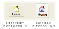
Last week, I wrote that Winstripe icons look like those icons taken from older Windows. Ever wonder how old it is? Well, I have Internet Explorer 3 on my hard drive, launched it, and found out that Winstripe Home icon looks almost like its Home icon. And how old is Internet Explorer 3? I'm not sure. At least, Winstripe Home icon is comparatively more colourful.
Creating the vector form of Winstripe Home icon is pretty hard. The pixels are so clear, making it difficult for me to figure out its initial look. The chimney, for example, looks so pixelated that I have no idea what should it look like in the real vector form. No choice but to follow the pixels, exactly. I would have thought of leaving out the chimney because I've seen some other icons which doesn't include it on top of the roof. As the matter a fact, I never even see a real chimney before in my life. Trust me, the chimney is a bad idea in Malaysia.
Actually, what makes the Winstripe Home icon look old? In my opinion, it's the colours. I modify the icon to match Windows XP colour palette, and also the chimney to be more vectorised. Yes, it looks much better.
However, some Firefox users dislike its flat look. It feels as if the house is made of card boards. The shadow effect of the Winstripe Home icon is not enough to reveal its dimensional perspective. A house is a three-dimensional object, therefore the icon needs to be in that way, which most people like.
Okay, let's evaluate the Luna way. The Luna Home icon uses a perspective grid, which the front wall of the house faces you at a different angle. I've modified it with few Winstripe texture and it looks a bit ugly. From my understanding in icon design, this icon is not suitable for the toolbars. Toolbar icons should be as readable as possible on the screen because they reflect the functionality and purpose of the toolbar buttons. Therefore, two-dimensional design is more preferable, with much better clarity for our eyes, though it may not be eye-catching.
So, I personally prefer the modified Winstripe Home icon. I believe it's better.