Mozilla Firefox 0.9 Release Candidate released today!! Oh, I mean yesterday. Or maybe my time zone here is a bit different. Or maybe I'm a little late. Neil Turner already had a tour, much earlier than I do. I took my time to download it, since it's only 4.7Mb, very much smaller than Firefox 0.8. The installation went on smoothly, as expected. As always, I'm impressed with the speed of Firefox. I had a tour around this release candidate and don't worry, I won't be repeating what Neil wrote on his tour. I am more focused on the delicate details.

So far the Winstripe icons blends pretty well on Windows XP. At a glance, the icons look like pixel art, applied with vibrant colours, specifically using most of the Windows XP colour palette. The hovered state of the icons seems to follow the XP guidelines, which is to change the colour saturation. The disabled state of the icons are grayscaled and slightly opaque. I found that the icons in Bookmarks Manager mistakenly doesn't include hovered states. There are no icons at all in Javascript Console. The throbber looks very familiar with Safari's throbber, which proves to be quite an intuitive indicator for loading web pages. The folder and document icons are very simple and friendly to the eyes. I took a second look at the toolbars, also discovered that the dropmarkers are much smaller than usual, compared to previous builds.

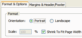
Focusing on other details, the Portrait and Landscape icons are missing from the Page Setup window. They are also missing from the toolbar of the Print Preview window. Maybe Kevin Gerich hasn't created them yet. Thinking about it, I wonder if these icons are redundant. Somehow the Page Setup window looks very clean without them. Also note that Internet Explorer doesn't have such icons, though.

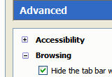
Moving on to the Options window, I don't see anything special. One thing that got my attention is the twisties, the plus or minus sign that expands or abstracts certain interface elements. In previous Firefox builds, the twisties are plain grey-and-white images, which doesn't follow the native twisties of the operating system. In this build, I could see that the Mozilla developers changed the image into a new one, looks slightly similar with the Luna twisties. It looks good, blended with some Winstripe colours, but not yet native-looking.

Next are the new Themes and Extensions manager windows. Both look quite the same to me, except that the iconised buttons don't feel native on Windows. Oddly enough, the icons of the buttons doesn't even feel like Winstripe. The icons look dull, painted with incorrect colours. I supposed those are pre-release icons? Created by Ben Goodger, I guess?
Overall, I'm satisfied with Winstripe. I like its simplicity. Well done indeed. I hope it can be improved further, to satisfy other Firefox users too. Firefox 0.9 will be great!