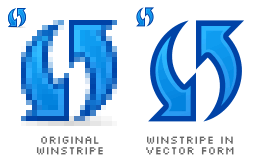
Reload or Refresh? Internet Explorer uses Refresh. Mozilla and Opera use Reload. Both has the same meaning and function. Both has the same icon, which displays two arrows pointing in opposite direction, in circular form. One of the most creative Reload icons I've ever seen is Qute's, which shows an arrow circulating a document icon, three-dimensionally. As for the Winstripe Reload icon, it looks just a bit plain and two-dimensional.

Creating the vector form of Winstripe Reload icon is easy. It's blue in colour and has arrows with sharp edges. At first glance, it looks normal, where we have nothing to argue about. At second glance, you'll find out that the arrows are positioned at a different angle. Some Firefox users are not used to that specific angle, maybe because Internet Explorer renders the Reload arrows at a different straight angle. That is only 90 degrees of difference between Luna Reload and Winstripe Reload icons.

Rotated to 90 degrees angle, the Reload icon might look better, though it looks just the same to me. Maybe it feels more common, as usually seen by most Windows users.
There are some other Reload icons which use only one arrow, instead of two. I tried it with Winstripe styles, and it doesn't look quite right. I might have designed it in the wrong way, I supposed.

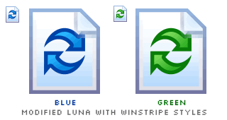
I try the Luna approach, again, positioning the Reload icon on top of a Winstripe-styled document icon. To match even more like the Luna Reload icon, I change the colour of the Winstripe Reload icon from blue to green, just to see the results. Not much difference. The document icon seems redundant, by the way. The arrows are reasonable enough to signify its function.
The original Winstripe Reload icon is my preferred choice. It's the winner. It's a beautiful artwork.