I tried to design a jigsaw puzzle. I want it to look cool, three-dimensional and a bit realistic. I'm not sure why, but ever since I've started getting into graphics design, a jigsaw puzzle is one of the first few things popping up my mind.
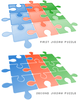
Let's take a look at my first attempt. The virtual three-dimensional perspective grid is okay, making it look being stacked on the floor. The colour gradients are quite poor, causing certain areas fade too much. The puzzle pieces don't seem realistic enough, in my opinion. These weaknesses made me wonder what is missing in this picture. Are the colours too vibrant? Not enough colour gradient effects?
Well now, behold the second jigsaw puzzle. I've reduced the gradients and added some light and shadow lines around the edges of the puzzles. The colours are more solid and the whole thing stands out so well. Some of you may not like it but I'm satisfied with these improvements. It could be a small step for everyone else, but a big step for me.
If you are interested to take a closer look, simply browse around and sure to find it easily. You will know the reason of this weblog post, too.