I once read a very interesting article written by Andrei Herasimchuk. It's about the potential rebranding of the W3C logo, added with a little sense of playfulness. It inspires me and opens up a new dimension in my understanding of logo design. I agree much as what he has quoted:
Everyone has certain designers they look up to.
So do I.
Few weeks ago, Liew Cheon Fong officially launched the Malaysia Bloggers Forum. As advertised, it's a forum dedicated for local bloggers to build a bloggers community and help each others on blogging. It's quite interesting as the site acts as a discussion portal for Malaysian bloggers, much like Project Petaling Street as the nationwide aggregation portal. Currently, the forum is still very new, with not many members. I understand this condition very well because it's hard to maintain a forum. Besides, it also needs a logo, mainly for promotional purposes. This logo has to be unique and recognisable for Malaysian bloggers to gather and communicate with each other.
I volunteered to create it.
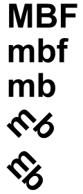
Most English-literate bloggers might be wondering, why is it 'Malaysia Bloggers'? It should be 'Malaysian Bloggers', right? Well, Liew commented that it's too late, unfortunately. From the discussion among the members, 'Malaysia Bloggers Forum' can be abbreviated as 'MBF', so that it would be easily remembered and keyboard-friendly. So, I type out 'MBF' in my graphic editor and look at it for few minutes. I try to crack my brain on how to play with the characters, but to no avail.
My second attempt is to lowercase the alphabets. My eyes start to blink as the letter 'f' is kind of disturbing the flow of ideas into my brain. I thought of removing the 'f' but then, if I remove it, the 'forum' would be gone. Malaysia Bloggers Forum is a forum site so 'f' has to stay. Ironically, its domain name is MalaysiaBloggers.com instead of MalaysiaBloggersForum.com, so I guess it's safe enough to remove it. And by the way, this letter 'f' has a sinister sound to it.
Okay now, what's left here is 'mb'. These lowercased letters look very familiar as I exercise my head, tilting to left and right. After rotating and shifting the alphabets, I discover a much clearer picture. I attempt to transform the letters into a figure, spending few minutes of my time with pencil and paper.

Somehow, this simple figure of two characters evolves into a smiley icon. The letter 'm' turns into a winked pair of eyes, as 'b' turns into a tongued-out mouth. A circular shape with a yellow background is added to complete the picture. Some rough line edges are refined and the tongue is obviously coloured in red. I try to take a second look and the letter 'm' reminds me of McDonald's. A third look reveals that 'm' looks like number 3. A fourth look would show the unlucky number 13. How amusing.

It's time to apply some cosmetics to the smiley. Red, yellow, orange, brown and black are the main ingredients in this make up. At first, I create the yellowish smiley, with bright colours and shiny edges. Then, I thought if Malaysia Bloggers Forum is for all Malaysians, that would include all local races and religions. The major ethnics in Malaysia are Malay, Chinese and Indian. So, I create not one, but three smilies, with slightly different colours. I supposed these icons are distinguishable enough to differentiate between a Malay, Chinese and Indian? Maybe.
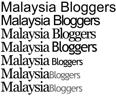
The next step is the type face. Since I've decided to ditch out the word 'forum' in the first place, I simply use the whole term, 'Malaysia Bloggers'. This could be a forward-compatible solution if in the future, the site has evolved from a simple forum to a social networking portal or something.
Initially, I go with Arial and squeeze all the redundant spacing between the characters. Then, I try Georgia, just to make the word 'Malaysia' to look more majestic. For the word 'Bloggers', I try to simulate Blogger.com's logo, using a combination of Trebuchet MS and Lucida Grande. A little font size adjustment, removal of word spacing and colour difference finish up the job. While I'm not the most experienced judge of my own artwork, I found this type to be quite simple and elegant. Or maybe I'm just too lazy to play with all the different font variations available on my computer and the web. Sigh.
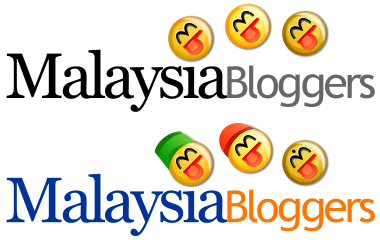
The final step is to strategically attach both the icons and type face together. From my perspective, black and grey don't seem to blend well with the icons, therefore I try other colour combinations till finally settling down with blue and orange. I'm not sure why I choose them, but maybe blue is one of the colours of the Malaysian flag and orange is the inverted colour of blue? Lame excuse, I know.
At the same time, I found that the icons are not ethnically distinguishable enough, despite the skin colour difference. Some additional make over are done to enhance the appearance of the icons. A songkok for the Malay smiley. A Chinese hat for the Chinese smiley. A dot for the Indian smiley, whatever the Indians call it? Sorry, I'm not Indian. Maybe I should have ask my Indian friends then. No offence.

The logo is almost complete, as I put some finishing touches and refinements. Add some decorations to the words and here it is, an unofficial logo for the Malaysia Bloggers Forum, rendered in its full glory.
Personally speaking, I like this logo very much. Yet, I doubt if anyone else would like it because there might be some other Malaysian graphic designers who disagree with me and maybe come out with a better logo. Please be reminded that I have never learn or take any courses on logo design before. Please correct me if I'm wrong.
As quoted by Andrei,
Corporate logos and brands are a tricky business. It's very difficult to make everyone happy and find consensus. I'm sure many of you reading this probably don't care for the logo. Such is the life of a designer.
I agree.