Green, green, green. Such a nice colour, isn't it?
For your information, today is the day that brings together web designers from all over the world to reboot their sites, launching their redesigns collectively. Of course, I'm not going to miss this, as I've also participated in the CSS Reboot campaign.
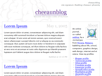
Actually, I've been thinking of a redesign for my weblog since last two months. Somehow, I keep on delaying it till I found CSS Reboot from Ash's weblog three weeks ago. Interesting, I thought. Even though I've heard some compliments from other people about my previous design, but personally I felt that it's too clean and plain boring. All greys, bordered boxes, limited colours and light images of a brain. Whoa, I wonder where is my creativity? Maybe this is my first official weblog, so I try an user-friendly design that is easy to the eyes. I got bored with rounded corners so I never bother using Douglas Bowman's Sliding Doors technique. This design is mainly focused on simplicity, with a blend of some playful CSS codes which are not quite noticeable, especially for Internet Explorer users. As I use shades of greys for this design, I call it 'grey matter', obviously.
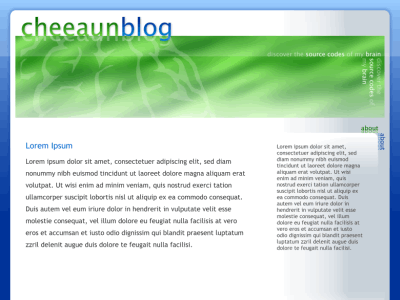
Now, for this campaign, I decided to design something cool, at least feel more energetic. I fire up my graphic editor and start to sketch. This initial design was inspired by Stanch.net. Using few vibrant colours such as green, blue and silver seem to live up the atmosphere. I was thinking of using one of the various image replacement techniques and also sIFR for the headings. As I start to type the codes, I discovered that this design requires non-semantical tags and can only be done in fixed-width layout. It's just too much work for me being a lazy guy, as my eyes start to get tired looking at the colour combination. This is a known problem among web designers, especially beginners, when they look at their own design every minute, they tend to get bored of it pretty quick. For example if you launch your redesign today, and by next two weeks, you'll feel that it looks rather old and out-dated. We as web designers should understand that our visitors don't see our web sites every minute, so they won't get bored like us. Anyway, I rejected this cool design and move on to another.
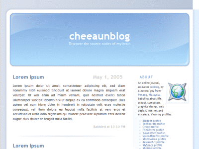
My second design candidate is called 'clear mind'. The reason for this name is maybe due to its soothing blue sky colours. Compared to the first candidate, this is much simpler. I like this so much that I immediately start coding and finish up in just one day. Unfortunately, it's also a fixed-width design, using Dan Cederholm's popular Faux Columns technique, though I can actually make it fluid. Before I decide to finalise this design, I asked for Jinny's opinion. She told me that it looks so much like Michael Heilemann's famous Kubrick theme, which is currently the default theme for WordPress. I see, the design might look similar, but the codes should be slightly different, all typed with my own hands. Okay then, I took Jinny's comment into consideration and decided not to use this design, too. I suspect there might be a lot of Kubrick-inspired sites out there, so I don't want to be one of them. I want to be unique.
Few days ago, Jinny added a new skin to her site called 'asian'. It looks simple and nice. Sometimes, I wish to create such easy-looking sites and don't care of anything else. Her asian design kind of inspired me, in a different way. As I was forcing myself to think of a new design, suddenly green colours flash into my head. There is a reason why this happens. Last month, when I was in Singapore, I couldn't prevent myself spotting lime-coloured attires displayed around the shops in the mall. It's a fashion trend. Lime green is in.
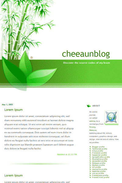
So, I thought I want to try using this specific colour for my next candidate. It reminds me of the Hulk, ironically. Then, it reminds me of leaves and then bamboos. Huh, wait the minute, why bamboos? I knocked my head quite hard and my mind flash back to a TVB television series which I watched on Astro Wah Lai Toi months or years ago. I forgot the name of the series, but so far I remember it's a story in ancient China, about an artist who loves to paint bamboo arts, filled with meanings and feelings. I was in love with bamboo paintings.
Immediately, I search for bamboo paintings, and downloaded about 100 images of it, consuming approximately 5 Mb space of my hard drive. I look at them one by one, trying to learn the brush strokes and get some rough ideas on the nature of bamboos. Again, I fire up my image editor and start painting, using the mouse instead of a real brush. The process took me two days to finish. After that, I start to create additional images and the stylesheet. This time, the design is not fixed but elastic. Yes, it's ideally elastic, combined with Andrew Clover's minmax.js script specially made for the other browser.
Now, this 'green mind' design is open to the public. Please enjoy and feel free to tear it apart.
Note: No bamboos were harmed during the production of this redesign. Not even a leaf.