Last week, I've been trying to make PenangBloggers.com mobile-friendly so that phone or PDA users could look out for the latest blog posts. Also, I would love to include iPhone as well. And perhaps try to create an iPhone-friendly site since there are so many out there. As the matter a fact, it shouldn't be called 'iPhone-friendly' because iPod touch has Mobile Safari as well. So, it's better that I use the term 'Mobile Safari-friendly'.
First, I start with the development for Mobile Safari. It's cool. It's one of the best mobile web browsers ever.
But, I don't have an iPhone.
Or iPod Touch.
How?
Here, I'll reveal the steps:
You need a template. A complete web template that is made for Mobile Safari. Knox iPhone Template is the one, which is also packed with Joe Hewitt's iPhone navigation work, iUI. Play around, it's really simple. It's truly amazing that Mobile Safari could support Javascript. Even Bejeweled for iPhone uses Mootools!
You need Safari. The desktop web browser, I mean. As of now, the version 3 Public Beta is great and free for both Mac and PC. Why do you need it? It's because I found that the template contains Safari-proprietary styles such as
-webkit-border-imageand-webkit-text-size-adjust. Those doesn't work on other browsers.You need an emulator. A Mobile Safari emulator. An iPhone simulator. An iPod Touch simulator. Anything. iPhoney looks really good, but it works only on Mac. I'm on Windows, so the only solution is the online iPhone tester and TestiPhone.com. These sites require Safari 3 for the real experience.
You need Mobile Safari. Buy iPhone. Just kidding. At least, pick one from your friends list who owns the device and ask them to test the site. Here in Malaysia, it's hard to find that particular person. I do know few, but don't have the guts to ask them, don't ask me why. Perhaps I'll just walk to an Apple reseller store, try out iPod Touch and probably load the site in Mobile Safari. Later, I found that there's no Internet connection there.
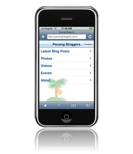
The final result is the Mobile Safari-friendly version of PenangBloggers.com.
Cool. I did it!
However, the GeminiGeek guy, who shares the same birth date as myself, told me that iPhone is not hot stuff in Malaysia, yet. I got excited on my own in the forums. Hmm...
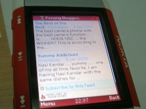
Okay now, let's do a non-Mobile-Safari version of the mobile site. What other mobile web browsers do we have? Of course, we have the great Opera Mini! My Nokia 5300 has a built-in browser which I really hate to use. I use Opera Mini all the time. I did a search online and found a publisher tip from Feedburner on how to make your site mobile friendly in under 5 minutes.
The article explains everything in details, but I'll wrap it up in a simple and quick list here:
Publish your site feed with FeedBurner. This is compulsory.
Sign in, go to the particular feed page, and under the 'Publicize' tab, go to the 'BuzzBoost' page.
Set up the settings and display preferences, then Activate the service.
Embed the BuzzBoost code on a web page and make it accessible via URLs such as 'domainname.com/mobile', 'domainname.com/m' or 'm.domainname.com'.
Test the site with the Opera Mini simulator or on your mobile device.
Done!
The final result is a mobile-friendly version of PenangBloggers.com. Sure, I did some customizations on the page stylings, so that it looks nice on Opera Mini, on my phone. It should work on other mobile browsers as well, though the page doesn't work on the built-in browser of my phone because it doesn't support Javascript. Who cares, right?
The mobile pages are up and running. I hope this will be useful for the visitors of PenangBloggers.com and interested web developers.