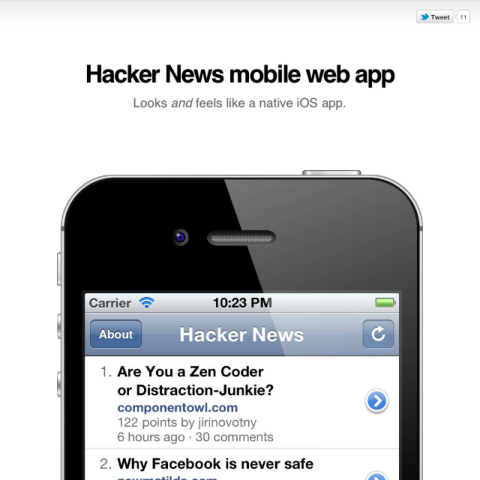
Last month, I tweeted about one of my recent projects, the Hacker News mobile web app. It's a simple little app to read Hacker News' stories and comments in Mobile Safari. It started out as an experiment for me to try one of the new CSS extensions introduced in Mobile Safari in iOS5, -webkit-overflow-scrolling: touch which uses native-style scrolling in an overflow: scroll element.
Before working on this app, I've also worked on another project called Kanade which is a mobile web app that shows a list of anime series for every season. Despite the functionality, the actual reason I create it is that I want to try creating a web app that not only looks native but feels native. There were a bunch of articles for the past few months on the topic of web apps vs native apps which everyone tries to outline the advantages and disadvantages of both platforms. I don't really want to jump into this topic here but I ask myself, is it hard to emulate things that native apps can do very well, on a web app? This idea is not new as I was inspired by Jonathan Snook's presentation on Fake it 'til you make it. In fact, I see it as a challenge, not just an idea.
There are two parts; the look and the feel. A web app may look native, but may not feel native, vice versa.
For brevity sake, I'll use the term 'HNmobile' for 'Hacker New mobile web app'.
The look
Every operating system has its own native look. In this case, I'm interested in iOS, particularly on the iPhone because iOS on the iPad is a little bit different.
There are frameworks that provide iOS native look for web apps such as iUI, UiUIKit, iWebKit, WebApp.Net and iOS-inspired jQuery Mobile theme. In my opinion, these are really great and would totally save my time figuring out the color values and dimensions of every interface element. But, they are not perfect. As I poke around, I find that some measurements are off by 1-2 pixels and some colors have slightly different RGB values. These projects have to work in other devices besides iPhone, so there are tradeoffs for things like theme customization and browser-specific fixes. I have to choose between two options, either it looks almost the same as a native app or exactly the same.
The latter, of course.
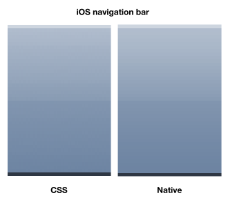
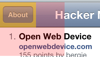
I start by getting screenshots. Lots of screenshots. For every single element that I need to clone. The navigation bar, buttons, background patterns, arrows, fonts, lists, colours, gradients and shadows. Let's start with the navigation bar. Initially I plan to do everything in CSS without images, something like this (skipping the vendor prefixes for readability):
background-color: #b2bbca;
background-image: linear-gradient(top, #b0bccd, #889bb3 50%, #8195af 51%, #6d84a2);
background-clip: padding-box;
background-size: 1px 100%;
background-repeat: repeat-x;
border-top: 1px solid #cdd5df;
border-bottom: 1px solid #2e3744;
The result is surprisingly good if you compare it with the native interface.
That's simple. Next, let's take a look at the buttons on the navigation bar. If you look closely at them, you might notice some inner shadows and gradients. Well it's more than meets the eye.
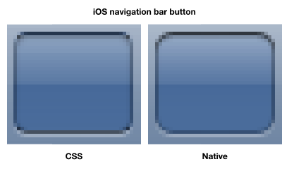
It's quite hard to create this in 100% pure CSS. Not exactly the same at least. The figure shows the CSS button I used for the Kanade app, not really best-effort but almost there. There's a lot of alpha-transparency here. I have to guess the opacity levels, the border radius, and color-pick the borders. You might even notice that iOS's borders actually have gradients on them. Instead of using CSS border property, I use box-shadow with inset value so that it blends together with the gloss effect.
If this doesn't look complex to you, now take a look at the Back button:
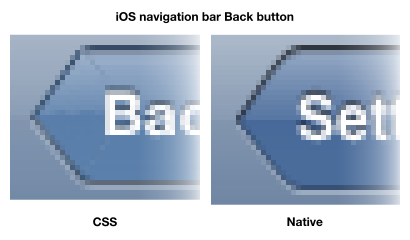
The pure no-images CSS version is based on a little guide by Jeff Batterton. It's a pretty smart technique to rotate a square div to form the arrow, though you might see some artifacts there. Still, it's not exactly the same as the native button.
How about the retina display? With CSS borders and shadows, 1px ends up becoming 2px on Mobile Safari. Well there is a hidden gem found by Brad Birdsall that can create half pixel borders. It might work, but my main concern with using all these fancy CSS gradients and shadows, is it slows things down. The browser basically have to use the CPU to generate the gradients, then render them. It might not affect much on a small web app and I didn't really do any comprehensive benchmarks on this, but I prefer to reserve that CPU power to do something else than generating gradients.
After one month of developing HNmobile, I decided to use static images for the buttons, and eventually the navigation bar. At first, I try to create the images from scratch in vector forms which later I realised that I don't have to. So behold, probably the very first native mobile web app on the planet, the iPhone User Guide web site (view it on Mobile Safari or spoof with the iPhone user agent string)
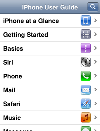
For some reason, when I view the site on my iPhone 4S, some of the images are not displayed in their retina form. But if you read the CSS, iAd.css to be exact, retina images are referenced. Digging through this gem, I found almost all the images needed for the app and most of them are 32-bit images with alpha-transparency!

I still have to create the other images myself such as the reload icon and the loading indicator. Most native apps and some sites now provide two images for both non-retina and retina displays. For HNmobile, I use only retina images and downsize them with CSS for non-retina displays. There is a number of resources to do this with CSS properties like background-size and border-image, and one of them is the article Fun with Retina Display. Perhaps I'm being lazy here because providing two set of images depending on pixel density is kind of troublesome in my opinion. I might change my mind if things break but for now, it works great.
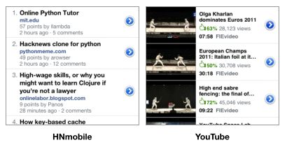
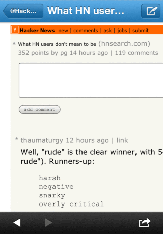
With the images in place, I proceed with the whole layout of the app, copying every single pixel and measurements from native iPhone apps. HNmobile's table view is largely inspired by the native YouTube app. Tap on the table cell to view the video, tap on the detail disclosure button (the blue-coloured button) to view the video details. Same concept for HNmobile.
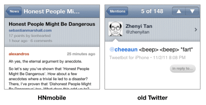
For the details/comments page of HNmobile, I refer to the old Twitter app's tweet view. I was planning to copy YouTube's layout but I need the extra space because some comments in Hacker News tend to get very lengthy, unlike the comments in YouTube.
HNmobile shows threaded comments for each story. I've never seen any good implementation of threaded comments interface on any iPhone apps, so I experimented a little here, using arrows to indicate the parent-child hierarchy of the comments.

As some stories might have a huge number of comments or super lengthy comments, HNmobile intelligently collapse the threads so that you don't have to scroll like mad.
The feel
As I mentioned, a native-looking app is not good enough. It has to feel native.
The very first problem for mobile web apps is always the scrolling, for overflow: scroll elements. When I develop Kanade, I use the iScroll script. There are also other similar scripts like Scrollability, TouchScroll and Scroller. Scrollability is said to perform the best among all. iScroll has the most features including pull-to-refresh and pinch-to-zoom, and is compatible with wider range of devices and browsers. However, scrolling performance is important for HNmobile and nothing can beat the buttery-smooth native scrolling, which is why I'm very excited when iOS5 Mobile Safari introduces -webkit-overflow-scrolling: touch.
And it is this feature that sparks the beginning of HNmobile.
Native scrolling works very well but it has few tiny glitches. When the scroll area is at the top of a overflow: scroll element and the user scrolls up, the whole page is scrolled up instead showing a rubber-band effect. When it's at the bottom, the whole page is scrolled down. Here's a video on how it works and a better explanation by Joe Lambert. Few smart people immediately came up with JavaScript fixes, such as OverflowScrollingFix and ScrollFix. This is later superseded by a much better fix found by Matt Sahr which doesn't require JavaScript and uses nested divs with -webkit-overflow-scrolling: touch.
Another glitch with native scrolling is that Mobile Safari also disables scrolling to the top of the page when the status bar is tapped. For HNmobile, I want the scroll area to be scrolled to the top when the status bar is tapped. As a workaround, I try binding a tap event to the navigation bar to do the same thing, hoping that the user might accidentally tap there when trying to reach for the status bar. Else, I would have to give up using -webkit-overflow-scrolling: touch and use the scrolling scripts which I could then use another workaround to make the scroll-to-top thing works. This is sadly a known bug for HNmobile, and I might just wait for Apple developers to fix this hopefully in the next release of iOS.
The second problem for a mobile web app is 'tap'. This has been explained by various articles like:
- Miliseconds responsiveness and the fast tap by David Kaneda
- Remove onClick delay on webkit for iPhone by Matteo Spinelli
- Creating Fast Buttons for Mobile Web Applications by Ryan Fioravanti
- Event delegation for touch events in JavaScript by Alex Gibson
Basically, Mobile Safari doesn't have a 'tap' event, and its 'click' event is delayed by 300ms, thus making the web app feels unresponsive to users. For HNmobile, I've created my own JavaScript library to solve this, called Tappable. Other libraries have implemented their own 'tap' event as well, such as jQTouch, jQuery Mobile, jQuery.tappable, Zepto.js, MooTools Mobile and tap.js. Some of these libraries also provide additional gesture events such as 'double tap' and 'swipe'.
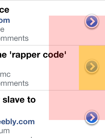
Tappable is developed with only the 'tap' event in mind, and eventually does it better in my opinion. The first part you might notice in HNmobile, is the tapping hit-area for the navigation buttons is actually larger than it appears.

The second part is enhanced by Tappable, and is best explained by this article written by Matt Gemmell in 2008, quoted:
The interesting thing is that the area in which you can tap to initially trigger the button is different from the area you must drag out of in order to cancel the operation - the latter is bigger! This applies to a large majority of all the buttons on the device.
The yellow marks the hit-area. The red marks the trigger-area. If your finger is within the trigger-area and lifted up from the screen, the button will be triggered. You have to drag your finger out of the red area to cancel the trigger on the button.
I'm not very sure what's the correct dimension for this trigger area, so it's all guesses for now. By default, Tappable sets this to 50 pixels boundary around the element, which I think should be good enough.
As you might expect, the detail disclosure buttons have the large hit and trigger areas too. Unlike the navigation buttons which stays on a fixed toolbar, these buttons are located in the scrollable area. Normally if you tap on the button and drag your finger, the content will scroll and the trigger is canceled. But if you hold the tap for more than roughly 100 ms and then drag your finger, the content won't scroll and you would need to drag the finger out of the trigger area to cancel the operation. This is quite subtle and you might need to try it few times on a native iOS app. My point is, Tappable is built specially for these cases, with many options to control the behaviour and timing of the tap.
Moving on to the third problem, animation. On iPhone apps, page transitions always seem so smooth when you navigate from one page to another by tapping an item in a list. This transition animation is actually quite complex, which was mentioned in the article by John Blackburn, A closer look at iPhone transition animations. I've even made a video screencast to see them clearly and figure out how it's all done.
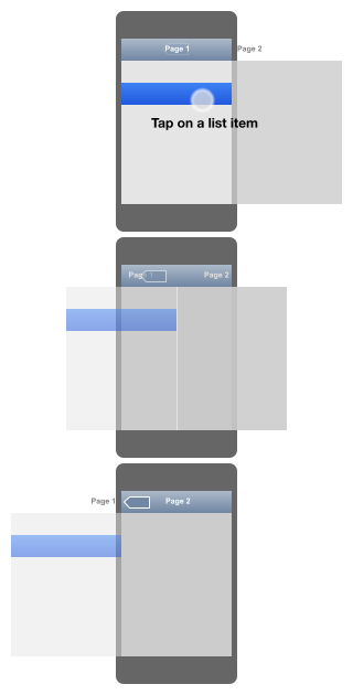
This rough sketch shows the transitions between two pages, from the beginning, half-way till the end of the animation. See how the title of the navigation bar slides from the center to the left outer edge of the screen. See how the Back button fades in from the center to the left side of the navigation bar. It's not one but multiple animations at the same time. To achieve this transition accurately, you have to use JavaScript to calculate the position for multiple elements where there are cases such as the title of the navigation bar varies in length, size of buttons varies in width and different viewport dimension based on device orientation. Remember that these have to be animated with CSS transform so that they are hardware-accelerated in Mobile Safari.
For HNmobile, I cheated a little by coding all of them in pure CSS, thus lacking the precise positioning during the transition. It's just good enough to trick your eyes that everything slides smoothly and feels native. The only project I know that implement this accurately is Sencha Touch 2, which they call it the Navigation View. Also not forgetting that the Gmail Mobile web app also have this page transition effect, though not quite accurate.
The other page transition on HNmobile is the flip animation when tapping on the 'About' button. This is basically like the flip animation from jQuery Mobile which were originally inspired by jQTouch, but with some extra tweaks to make it to look as much like iOS's flip animation.
The user experience
Now that we have the look and feel, what's left? Of course, use it! Obviously I'm eating my own dog food and have been using HNmobile since the day I start developing it.
At first, I plan to make HNmobile a standalone web app, simply by adding this meta tag:
<meta name="apple-mobile-web-app-capable" content="yes">
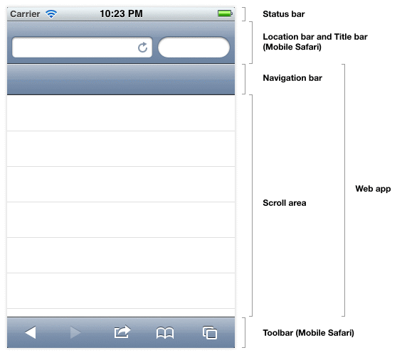
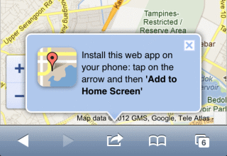
This will hide Mobile Safari's chrome which includes the location bar at the top and the toolbar at the bottom. It only works when the user adds the app to the Home screen and launch it there. So, first-time users loading the app will see the browser chrome. Some web apps like Google Maps might detect this standalone mode and show a floating balloon to invite the user to add the app to the Home screen.
However, I found few issues when using HNmobile in this mode. Tapping on links will launch Mobile Safari, which jumps out of your standalone app. There's a way to prevent that and make it load inside the standalone app, but since the toolbar is gone, there's no Back button and you can't go back. This is okay if the link goes to your own site where you have full control, but if it's going to other sites then your app basically got kicked out. So how about loading the link in an iframe and keep the user within the app? The experience can be like tapping on links in an iPhone Twitter client which implements a built-in browser so that the user stays in the app. Unfortunately, iframe doesn't work well on any mobile browsers and some sites implement those framebuster scripts that prevents a web page from being displayed inside an iframe.
For few weeks, I tried using HNmobile in standalone mode with links that launch in Mobile Safari. It was tedious. I tap on a story link, it switches to Mobile Safari. After that, I double-tap on the Home button to go back to HNmobile. Rinse and repeat.
If I'm not mistaken, third-party native iPhone apps in the early days have this exact problem too. It's the reason why iPhone apps implement their own built-in browser to view links. The built-in browser is like a stripped-down version of Mobile Safari, without the bookmarks, location bar, search bar and tabs. When the user tap on a link that loads into a built-in browser and wants to bookmark the site, he or she would have to switch to Mobile Safari first before bookmarking. It's just a quick view of the link. Anything more than that, the user has to re-open it in Mobile Safari.
HNmobile, in its current state, has the best of both worlds, like a hybrid web app and native app. There's no standalone mode. No iframes. No stripped-down browser. No app-switching. Instead of trying to be an app on its own, HNmobile lives inside Mobile Safari, embracing all the features that you can use there. When you tap on a story link, it just load the page. If you want to go back, press the Back button on the toolbar and HNmobile will restore to the last state where you left off. You can also tap and hold the story link which shows you the context menu with options to copy the link or load it in a new tab. If you want to view the readable version of the article, just use Mobile Safari's Reader. These are existing browser features and there's no need for me to reinvent the wheel, implementing features like context menus or Readability into HNmobile itself.
Surprisingly, it took me quite a while to figure this out, and I think it works pretty well.
The imperfection
It's not perfect, yet. The experimental -webkit-overflow-scrolling: touch sometimes cause some weird quirks. On rare occasions, the scroll area becomes pixelated and I have to reload the whole page. Some users report to me that they can't figure out how to show the location bar that's hidden when using HNmobile. There's not a lot of features as you can only do two things on HNmobile; check out the 'front page' stories and read comments.
I learn a lot from building this app and I plan to continue working on it, fixing the bugs and adding more improvements. The project is graciously hosted on GitHub and contributions are very welcomed. If you like HNmobile, do me a favor and share it with your friends!
Update 6 March 2012: Thanks for all the HN love!
Update 26 March 2012: Continue to the Part 2.