This is continued from the first part.
Before I begin, I would like to mention that I'm very surprised by the amazing response on the first article and the massive traffic hitting my site. It was seriously unexpected and quite meta.

The first part puts focus on the look and feel of the app. For this second part, I'll provide an addendum on some new things I found and various details on the development of the app.
iOS imitation
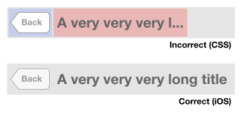
In the first article, I mentioned an example of rendering the Back button in pure CSS without images. It doesn't look that good and has artifacts on it. Well, there exists a way, way better implementation by Gregor Adams. It is the best pure CSS iOS Back button I've ever seen. Here's a comparison:
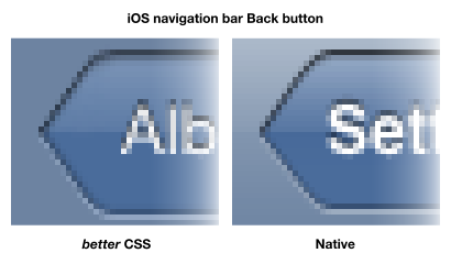
No artifacts and smooth edges. No images are used at all. It uses a lot of fancy CSS properties to achieve this almost exact replica.
This also leads me to discover even more impressive work by others who tried to mimic the iOS interface, such as CSSUIKit and -webkit-OS. I find -webkit-OS very interesting because it also replicate the look of the iOS Lock screen and Springboard, including slide-to-unlock and wiggling icons!
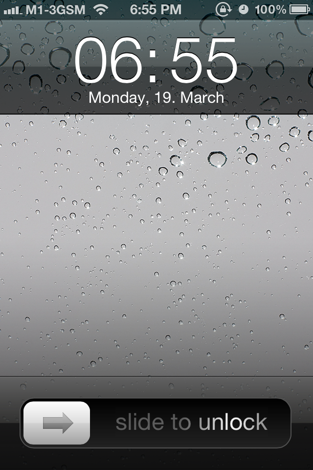
The screenshot above is -webkit-OS, a web page. The date and time is live, and you can slide to unlock to see the Springboard. The status bar is slightly translucent because of this code:
<meta name="apple-mobile-web-app-status-bar-style" content="black-translucent">
It works only on WebKit and I got to admit, it's really awesome.
Standalone mode
HNmobile doesn't launch in standalone mode. If you add it to your Home screen and launch it, it will open in Mobile Safari. It's not that I can't make it work, HNmobile is just the type of app that doesn't work well as a 'standalone' app. Why? How do you define a 'standalone' app?
From my observations, standalone mode only works for web apps that let users do everything in it. For HNmobile, you can read stories and comments. To view a story link, it has to open in Mobile Safari. That is no longer 'standalone' because you can't preview a link inside the web app. This is the reason why HNmobile doesn't launch in standalone mode and in the end, it turns out the app works better inside Mobile Safari instead.
So, what type of apps are suitable to be 'standalone'? Two examples.

First, this is Doubbble by Benjamin De Cock. It's a Dribbble viewer mobile web app. You may notice that Mobile Safari's toolbar is gone, that's standalone mode. You can view popular Dribbble shots or 'Following' shots, view individual shots and swipe through them. If given the time and effort to implement more of Dribbble's API, you can do pretty much anything without leaving the app.
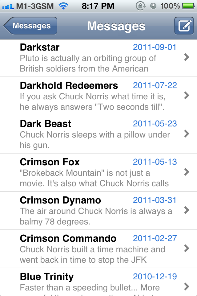
Second, this is Messenger by Philip Harrison, a mobile web app which I happen to find on GitHub. It's basically a clone of the iOS built-in Messages app. It's not really a working app, but it demonstrates the possibility of building a messaging or chatting mobile application. You can browse through messages, tap on them and see the whole thread. It even has pull-to-refresh, implemented together with -webkit-overflow-scrolling: touch.
These two example applications show content that can be consumed internally. For HNmobile, the story links, which is the main content, are external, requiring the user to launch them in another application. There may be external content as well for Messenger such as messages with URLs. That is okay because it's not the main content. Even the native Messages app launches links in Mobile Safari instead of a built-in browser.
Of course, this only applies to iOS-specific mobile web apps and if you're building one, remember to keep this in mind. As long as there's no way for me to simulate a built-in browser in a web app, HNmobile will remain being a non-standalone app.
Navigation bar
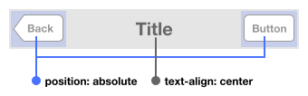
I'm always fascinated by the way iOS navigation bar layout works. It looks simple, yet not quite simple. Here's a simple sketch of the navigation bar layout with buttons:

The HTML code, in the most minimal form:
<header>
    <a href="#">Back</a>
    <h1>Title</h1>
    <a href="#">Button</a>
</header>
Initially, I didn't expect much and plan to just code this in a quick and easy way. Instead of using floats or other common CSS layout techniques, I experimented using the CSS Flexible Box Layout. Note that the one I use is the old standard, while the new one has debuted in some recent browsers. I suggest reading Paul Irish's article on Quick hits with the Flexible Box Model to understand the implementation, before reading this.
Here's how it looks like:
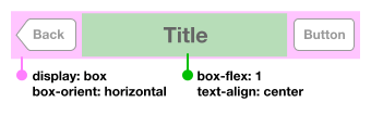
The CSS code box-flex: 1 will make the title container, in this case the h1 element, grow to fill the space. It works great, except for few cases. If one of the navigation bar buttons changes in width, the text alignment is shifted.
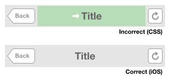
If the button is not there, it's also shifted.
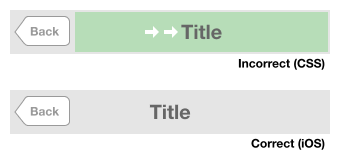
Same thing applies if one of the buttons got wider.
On iOS, the navigation bar title doesn't shift regardless of these minor layout changes. It should still maintain being at the center of the navigation bar and not pushed by the buttons. Interestingly, using CSS floats have the same issue as flexible box too, so I try absolute positioning on the buttons instead.
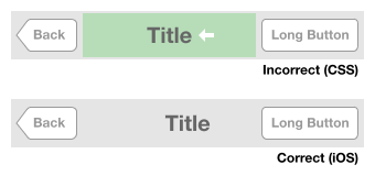
Now, the title text will always be in the center because absolute-positioned buttons will not affect it anymore. But when the text becomes too long, the title text goes under the buttons and they overlap over it.
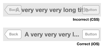
Longer buttons can also overlap on the title.
On iOS, even though the title alignment is not affected by the minor changes in the button width on both sides, it will eventually shift if the button becomes too long and intrudes the title's space. In the diagram above, the title becomes left-aligned along the Back button, and it seems like it still tries to be in the center of the navigation bar.
I try to fix the overlapping problem by applying some CSS margins:
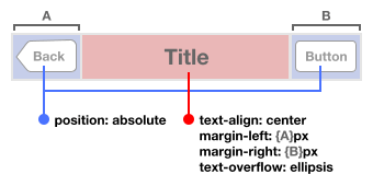
Remember that the left and right margins still have to be (almost) the same so that it won't shift the title like the first few diagrams above. And I have to hardcode them, knowing the width of the buttons in the first place. The title is also applied with text-overflow: ellipsis so that longer text will be clipped and shows the ellipsis character.
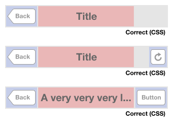
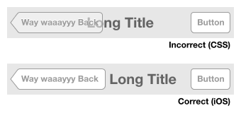
HNmobile currently uses this technique. It works in most cases, fortunately. The obvious case where it doesn't work correctly is when the title is long and there's no button on the right side:
Here you'll see that if the title is long and there's space around it, iOS will fill it up. Makes sense.
These are all the use cases I found when developing HNmobile, and there could be more other interesting ones. In the end, to implement this correctly, the layout has be done programmatically with JavaScript, not to mention that you still have to animate them when switching between pages. I hate to say this but this flexible layout just can't be done in pure 100% CSS, judging from my current knowledge of whatever CSS grid, positioning or text module specifications out there.
Putting things in perspective, this is merely a navigation bar, which takes up only 10% of the iPhone screen. It's simply remarkable that there's so much attention to detail in this.
Application Cache
HNmobile uses Application Cache for caching resources locally in the browser. It results in much faster subsequent page loads because practically no requests are done except to check for updated manifest file. It's amazing that GitHub sends the correct MIME type for manifest files, which is text/cache-manifest, else I wouldn't be able to host HNmobile on GitHub Pages.
For the past few weeks, I've deployed a number of updates and recently started using Google Analytics to track the update rate. To update the manifest file, the common technique is to add version numbers, like this:
CACHE MANIFEST
# version 1

CACHE
index.html
hn.css
...
However, the problem is, by just looking at the version number, you don't know when the update was deployed. A good tip here would be to use date strings, together with version numbers, just in case you like version numbers:
CACHE MANIFEST
# 2012-03-25:v1

CACHE
index.html
hn.css
...
Then I pass this to Google Analytics with Event Tracking so that I can see the version distribution among HNmobile users.
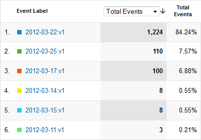
This is really useful for me to debug certain issues with Application Cache and find ways to make the updates propagate faster to users. As what most Mobile Gurus stated, Application Cache can be pretty clumsy. I still don't understand why there are less than 10% of users having the older version of the cache. Hopefully this tracking will help me uncovering the mysteries.
Error logging
Sometimes, it's hard to track client-side errors and exceptions. It may work well on your device, but strangely break on others. It's especially hard to debug because that device is not in your hands. There are ways to do client-side error logging, either to your own server or remotely with third-party services like ErrorStack, jsErrLog and Errorception. I decided to use Muscula for HNmobile, which is currently free so that I can get a rough idea on how it works.
After running it for weeks, first thing I realise is that it doesn't quite work with minified JavaScript files because the error is always reported at line number 1. Errorception mentioned this solution:
Instruct your minifier to preserve line-breaks in your minified code. There are two good reasons for this. Firstly, it makes line numbers actually meaningful in your bug reports. Secondly, when you do find an error it becomes very easy to debug even on production through a tool like Firebug or WebInspector.
I'm not sure if I'll do that, so I just leave it for now.
Besides that, there's also a bunch of errors that you need to specifically ignore because they are usually caused by browser extensions and social media widgets. Pamela Fox has compiled a list errors to be ignored in this gist, which I think is worth a read.
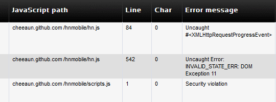
I believe this is the most interesting error message of all:
ReferenceError: Can't find variable: atomicFindClose
Even Google can't figure it out.
Miscellaneous
HNmobile uses node-hnapi, yet another unofficial API for Hacker News, which I built as an excuse to learn Node.js. It's hosted on Heroku and uses Redis for caching the JSON responses. Since it's hosted on another domain, the API supports CORS so that HNmobile can do cross-domain XMLHttpRequests. CORS require an interplay of server and client, and it only works on newer web browsers. Fortunately, Mobile Safari supports it, so that make things easier. The API is quite experimental for now, so expect it to be down few times when the load is high.
Another very interesting observation in the statistics reveal that some of the users are on iPad. I expect HNmobile works there too, even on the new iPad's Retina display. The problem is it's not optimized for the larger screen real estate. Tim Cook mentioned in a recent Apple event that iPad apps work great because they don't look like a blown-up, stretched-out smartphone app. Embarassingly, HNmobile looks like that right now.
More improvements are definitely coming to HNmobile. The app is released under the MIT license, so feel free to fork and report issues on GitHub. A big thanks to all users and everyone giving me valuable feedback.
Update 27 March 2012: HN post here.
Update 26 December 2012: This app is now called HackerWeb.