Two weeks ago, I gave a talk on "CSS-ing the Super Silly Hackathon website" at Talk.CSS #23 Party Edition 🎉 meetup. I realised that I didn't give any talks at all since last year in any meetups, so this is basically my first talk of the year and perhaps my last for this year 😌
The video of my talk is available on Engineers.SG (YouTube) and the slides are on my talks repository.
It's a 20-minute talk as I try to keep it short, so not everything is revealed. Thus, I'm going to write them down here.
🤔 What is Super Silly Hackathon?
It's an initiative sparked from a Facebook post by Min on September 29, which is then followed by 4 enthusiastic people including myself who somehow got into organizing a totally different kind of hackathon, inspired by The Stupid Hackathon.
In short, instead of focusing on building something to make the world a better place, it's an unhackathon for building something silly that no one ever needs 🤷♂️
Turns out there were already few stupid hackathons around the world:
- New York (original) http://www.stupidhackathon.com/
- San Francisco http://stupidhackathon.github.io/
- Toronto http://stupidhacktoronto.com/
- Amsterdam http://www.stupidhackathon.wtf/
- and more on this list that I've compiled...
🎨 Design time
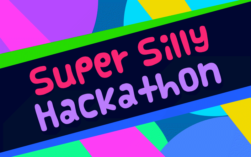
For the past few months, I've been sort of active in designing logos for the community 😉 So, I volunteered to design the logo for Super Silly Hackathon and came up with this around October:
The font is Vanilla designed by Cutie Explosion, as I wanted it too look like Comic Sans but not too much. The color scheme and art style is mostly inspired by a conference web site called Keep Ruby Weird and the opening of Boruto anime (Yes, that's Naruto's son).
For some reason, I tilted the text to give the impression of silliness, which later became the art direction of the whole web site. After a while, I felt that there were too many colors competing each other, so I adjusted and reduced the colors a bit:
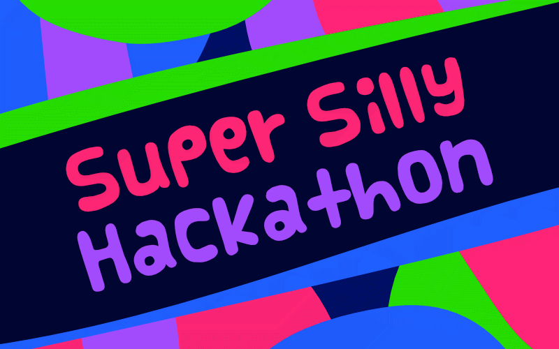
All the colors have 100% saturation, no straight lines and no perfect circles 😜
And… UniCat as the mascot (mascat?)!

It's everyone's favorite cat with a unicorn-like pink horn, creepy green eyes, cute red nose, two-instead-of-three blue whiskers and a cool purple bow tie. As I mentioned, there are no perfect circles. Every "circle" glyph, including the cat face and eyes, comes from the tittle of the letter 'i' of the Vanilla font!
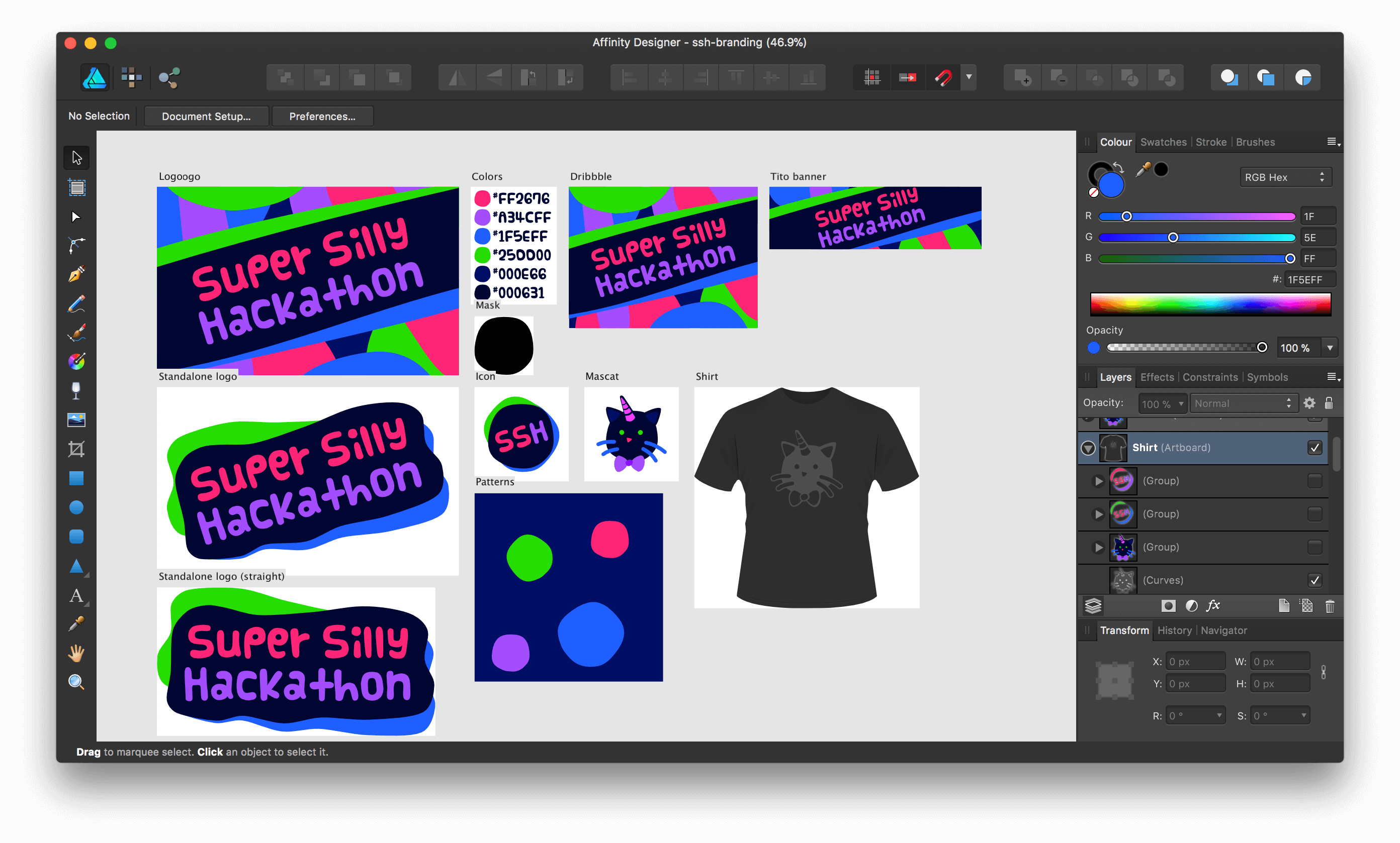
I use Affinity Designer and all files are open-sourced on GitHub.
😎 Webmaster mode
Over the years, I've always been fascinated by unique website designs, usually inspired by other mediums such as print magazines. I did a large header design for my personal site in 2005 (12 years ago! 😱). I made a horizontal-scrolling Tumblr theme in 2008 (9 years ago! 😱).
Once again, I'm reminded by Hui Jing's talk on drawing inspiration from graphic design and print designs that couldn't be built before, but they can be now.
As I look at the logo and think how I could make it different this time, I wonder if it would be horizontal scrolling again or something else? Horizontal scrolling is not that new anymore, so why not… diagonal? 🤔
Yeah, why not?
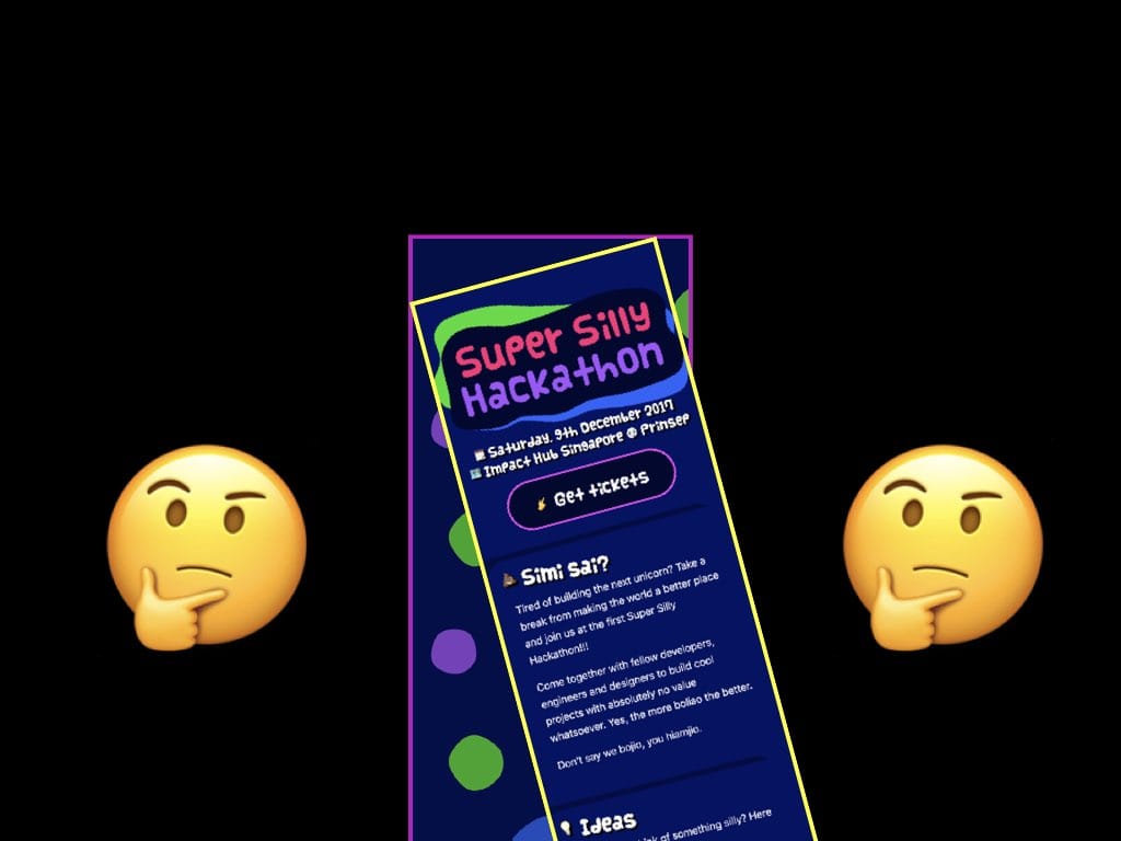
Lo and behold.
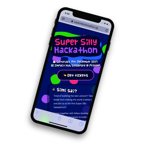
This is not a visual or Photoshop trick. There's nothing wrong with the phone frame. I purposely tilt it so that the site itself would look… vertical.
It's pretty difficult for me to explain to people how cool the site is until I tell them to try it on their phones. And when they try it out, I absolutely love the reaction on their faces!
At first, I don't fully understand why I tilt the logo for that impression of silliness. Until I see someone else look at the site on his/her phone, I realised that the person has to tilt the head or the phone to read the site, which in turn make themselves look silly! 🤣
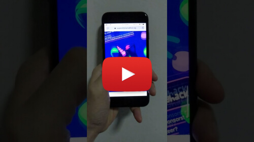
Go on, try the site now at supersillyhackathon.sg. I've also prepared a video to show how the scrolling feels like on Mobile Safari.
This could be the world's first diagonal-scrolling web site!
I posted a sneak peek on Twitter and Facebook on October 27. I officially launched the site on November 23.
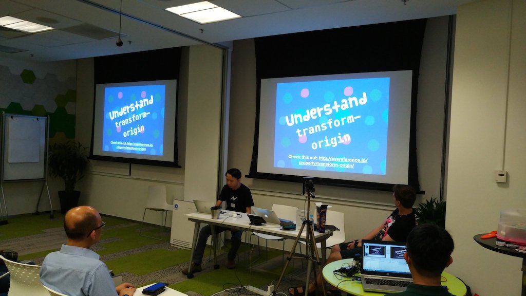
🔮 Diagonal sorcery magic
Some folks ask me how I did the diagonal scrolling thing. I suspect most people thought that it's just transform: rotate(-15deg).
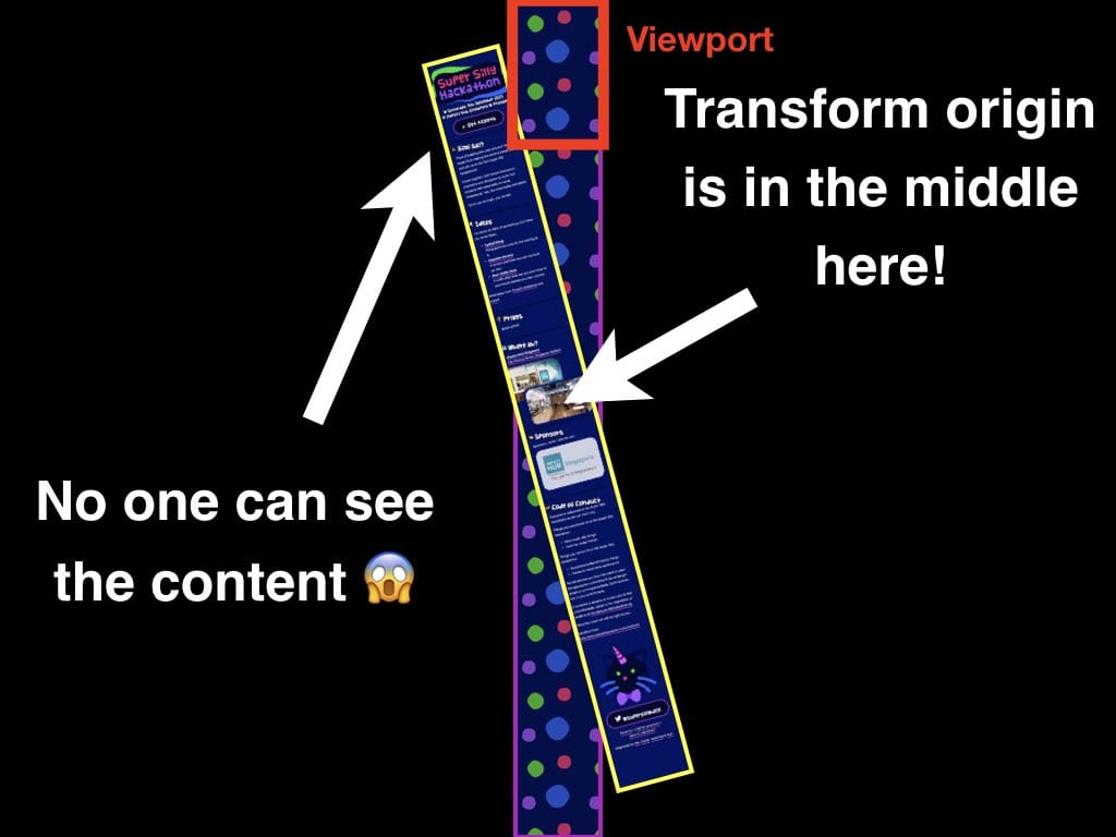
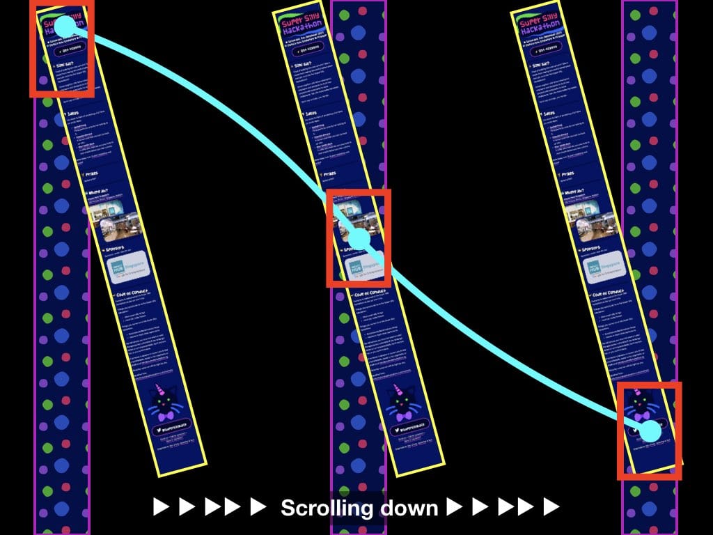
Nope, not that easy. By default, CSS transform-origin is at the center of the element. If the whole content (yellow bordered box) is rotated, the top part of the page would be shifted and hidden from the viewport (red bordered box) and no one can see the content 😱
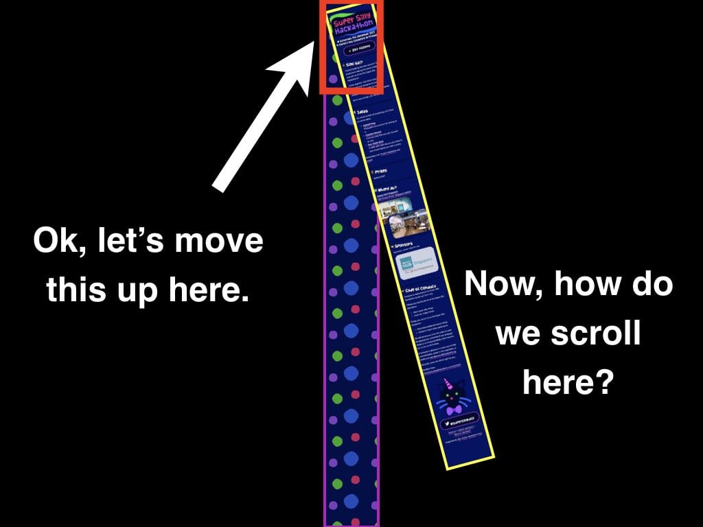
What I need to do is to move the content up, to the viewport area. Now, how do we scroll here? If you scroll downwards, you'll see nothing again because the rotated content is slowly shifted to the right. It's kind of weird. Should the user scroll horizontally to see the other side of the content? What happens if the user pinch zoom out of the page on mobile browsers?
I've made a few attempts.
First attempt: Move the transform-origin. I personally find this weird but if you understand transform-origin well enough, it's possible to actually move things around with it. Usually, we transition or animate elements based on the origin, but now we transition the origin itself!
As the page is scrolled downwards, I wrote a piece of JavaScript code to get the top scroll offset of the page and manipulate the transform-origin of the rotated element (yellow bordered box).
It's pretty cool and I was really mind-blown that this actually works!
window.onscroll = function(){
  var top = window.scrollY || window.pageYOffset;
  var origin = top + window.innerHeight/2;
  container.style.transformOrigin = 'center ' + origin + 'px';
}
As simple as… that 😱
Unfortunately, it's a bit slow and my gut feeling tells me that transitioning transform-origin is weird and doesn't feel right.
This leads to my second attempt: translateX CSS with awesome Math.
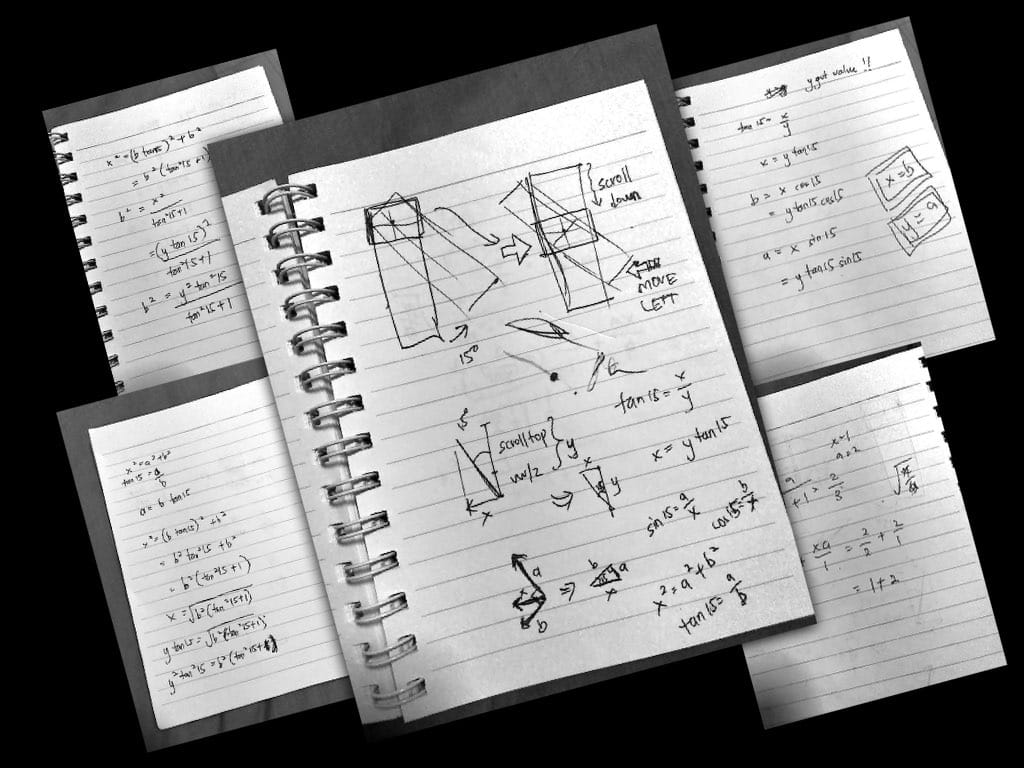
I took out my trusty notebook and started sketching. I looked up the Internet, found the formula that I've forgotten the name and realised that it's called Pythagorean theorem. I made a few mistakes and miscalculations in the beginning but somehow manage to slowly revive my good old Math skills.
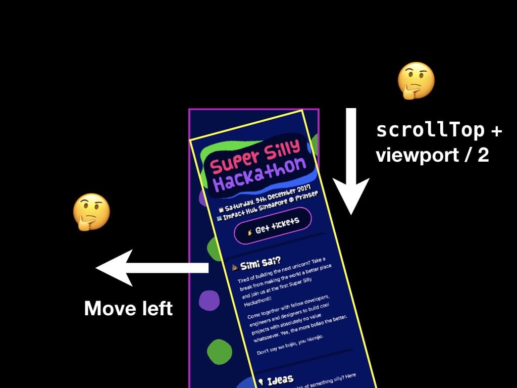
First, the basics; scroll down, move content to the left. I'll need the scrollTop value in addition to the viewport height divided by 2, because the origin is somewhere around there.
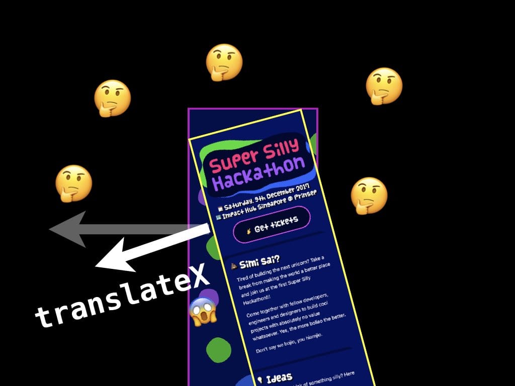
Unfortunately, things don't always go the way you want. Turns out that translateX doesn't move to the actual left. Since the content (yellow bordered box) is rotated, the whole X/Y axis has been rotated so translateX will eventually move to the bottom left 😅
At this point, awesome Math is definitely needed to solve the problem.
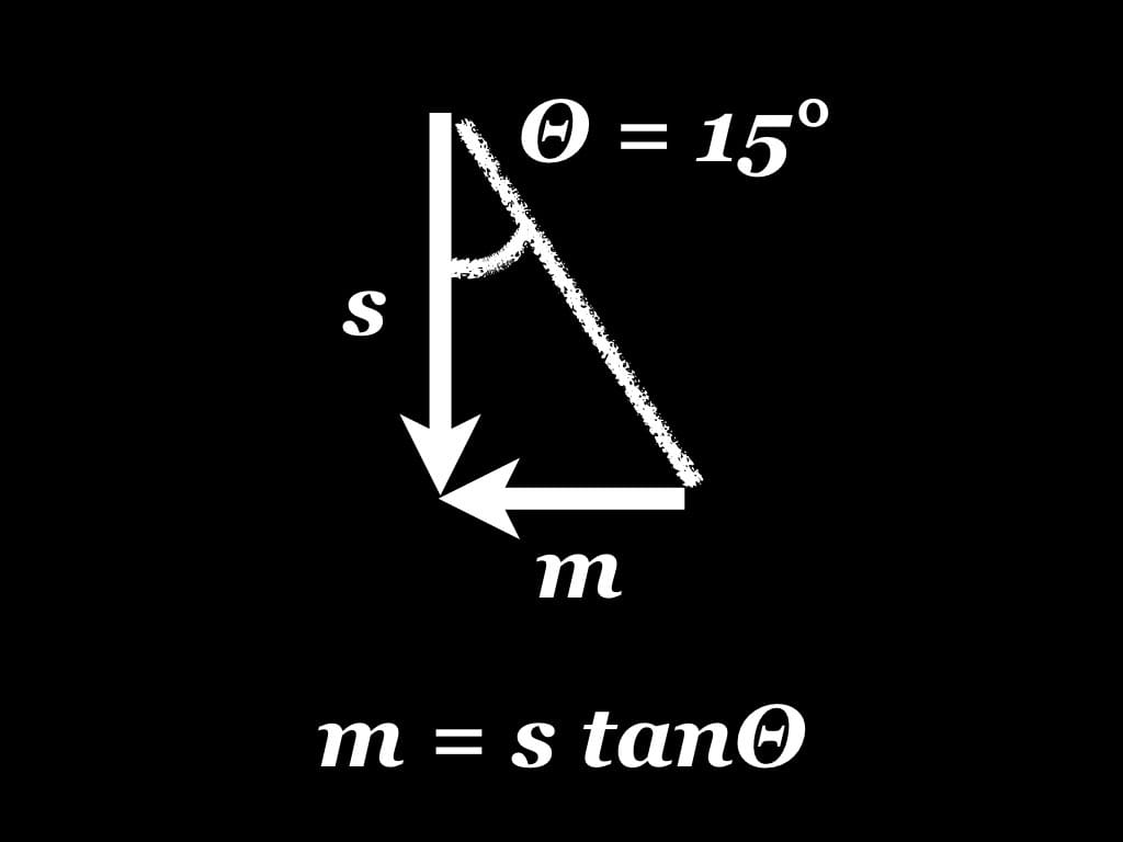
Yeap. m = s tanΘ. s is roughly the scroll top offset, m is the horizontal translation of the content and Θ is 15° because I'm the one who purposely set it.
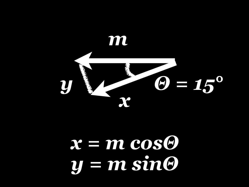
Yeap again. x = m cosΘ and y = m sinΘ. In order to move to the real left, I need to get the x and y values, as the content will move to bottom left (x) then move up again (y).
With all these formulas combined, magic happens and everything works exactly the same way as my first attempt! Zero compromise on functionality but more lines of code now:
var rad15deg = 15 * Math.PI / 180;
var tanRad15deg = Math.tan(rad15deg);
var cosRad15deg = Math.cos(rad15deg);
var sinRad15deg = Math.sin(rad15deg);
var bodyStyle = document.body.style;

window.onscroll = function(){
  var top = window.scrollY || window.pageYOffset;
  var a = -top * tanRad15deg;
  var x = a * cosRad15deg;
  var y = a * sinRad15deg;
  bodyStyle.transform = 'rotate3d(0, 0, 1, -15deg) translate3d(' + x + 'px, ' +  y + 'px, 0)';
};
Again, it's still kind of slow 😕. I think probably there's too much Math for the browser to handle?
Onwards to my third attempt: wrap around another div and translateX it.
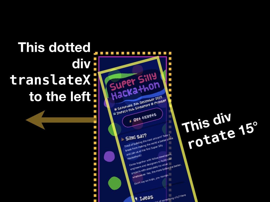
I wrap the content (yellow bordered box) with another container element div (dotted yellow bordered box). Since this new container is not rotated together with the content, its X/Y axis is not affected! Therefore, I don't need to calculate the sine and cosine values to get the real horizontal translation!
This attempt feels a bit faster and easier to control. With this extra container, I can hide the scrollbars easily with overflow-x: hidden, which will work on both desktop and Mobile Safari (special case here).
One very clear and surprising fact; the site performs well on mobile browsers, but decent on desktop browsers. Usually, mobile browsers have worse performance than desktop browsers, but this time, it's the other way around 🤷♂️
On my machine, the site scrolling is very, very laggy on Firefox. I have no idea why. After revealing the site, I've gotten a few feedback from some people...
Damn. On my monitor, for every scroll down, the entire thing is sort of like vibrating. My eyes died.
Then I use another Mac and the scroll is fluid. Ahhhh...
— Kiong
It doesn't work well on one Mac, but works well on another Mac 🤔
Because the background is not
fixed, scrolling on a mouse wheel creates a pretty strong flicker.— Ted
I suspect mouse-wheel scrolls at certain number of lines, so it "jumps" at specific transition points instead of smoothly transitioning between them with a smooth scroll 🤔
🕵️♂️ Research time
At this point, I don't know what's the cause of the problem. There are a few speculations in my mind, but I'll need to research.
One of the first things that I stumble upon is the term "scroll jank". It took me a while to find out the official definition of this term but I gave up and use this instead:
When you scroll a page and there's such a delay that the page doesn't feel anchored to your finger, that's called scroll jank.
This explanation seems to focus more on finger touch latency when scrolling web pages, but can be applied to normal trackpad or mouse scrolling as well.
Ultimately this leads to the discovery of passive event listeners. I looked up Can I use… and was surprised to see a lot of browsers now support it. I've also read about Firefox Quantum's latest Async Pan/Zoom (APZ) feature which decouples the scrolling from the JavaScript thread. Apparently I was confused by all these terms as I know that both are meant for making sure that nothing blocks scrolling, one is meant for touch events, and the other is a browser-side implementation.
I've also discovered Animation Worklet, while reading about Scroll-linked effects on MDN. It's quite a long read and honestly I just skimmed through keywords like "sticky positioning", "scroll-snapping" and "web animations". Animation Worklet was previously known as "Compositor Worker" since around 2015. There's an additional proposal to Web Animations specification that's for mapping scroll position to time and use it as a timeline for the animation. 🤯
Okay, let me step back a bit and rethink this over.
Scroll jank was a problem last time. Back in 2011, John Resig once wrote about attaching handlers to the window scroll event as a very, very bad idea. This leads to the term "Jank Busting" (2012) by preventing frame rate drops, debouncing scroll events, using requestAnimationFrame and ensuring a jank-free experience. Fast forward to today, browser developers have kind of solved this by introducing new methods, specifications and implementations.
But, why am I still seeing this lag on the Super Silly Hackathon website? 🤔
As I was trying to fix the jank issue, I saw this warning on Firefox Developer Tools' Console:
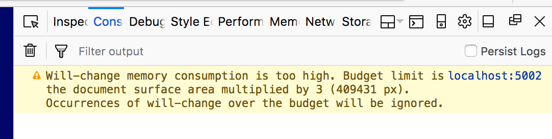
I applied the will-change CSS property on the whole rotated content and got this warning message:
Will-changememory consumption is too high. Budget limit is the document surface area multiplied by 3 (409431 px). Occurences ofwill-changeover the budget will be ignored.
Whoa. From my basic understanding of this property, I see will-change property as a better version of the translate3d(0, 0, 0) or translateZ(0) hacks as mentioned by Sara Soueidan's article on Everything You Need to Know About the CSS will-change Property (2014).
It's like asking the browser that I want one (or more than one) specific CSS property to be optimized magically and the browser will somehow answer "Yes". In this case, the browser answered "No" 😭. A little bit more reading reveals that one of the proper usage of will-change is:
Don't apply will-change to too many elements. The browser already tries as hard as it can to optimize everything. Some of the stronger optimizations that are likely to be tied to
will-changeend up using a lot of a machine’s resources, and when overused like this can cause the page to slow down or consume a lot of resources.
This is when it hits me.
Reducing paint areas is often a case of orchestrating your animations and transitions to not overlap as much, or finding ways to avoid animating certain parts of the page.
I stepped back and look at the web site again…
I see two very important points.
- Large paint areas. The whole rotated content is a huge large paint area. Technically speaking, the more content I put, the larger the paint area gets 😅
- Animate everything. The whole rotated content is translated horizontally when scrolling. Instead of animating only certain parts of the page, everything on the page is animated 😅
All this while, I've been doing things that are against all these best practices. Instead of minimizing paint areas, compositions, transitions and animations, everything is maximised! 😅😅😅 Despite these realizations, I'm still dumbfounded by the fact it's slower on a desktop than on a mobile 🙄
So in the end, I still have no idea what I'm doing but at least I learnt a few things 😊. For the past few days, I've been trying out a few methods to speed things up and I hope that I could somehow solve this 😁. For those of you who asked me if I found a solution yet, the answer is no for now 😬.
🦄 Trivia time!
Conforming to the name and theme of this hackathon, I tried my very best, that no one ever was, to have as much fun as possible building the site 😂
I hid a lot of fun stuff in the source code and was secretly hoping that someone would view source and read them. I didn't reveal them during my talk due to shortage of time and me being usually tired after a whole day of work 😜
On December 2, I'm super glad that finally someone view the source and found a few gems, though not all of them 😝
Trivia #1: I use emoji characters as CSS class names, animation names and even font names!
@font-face {
  font-family: '🍦';
  src: url('fonts/vanilla.woff2') format('woff2'), url('vanilla.woff') format('woff');
}

...

h1, h2, h3, button {
  font-family: 🍦, sans-serif;
}

...

.🦄🐱 {
  filter:
    drop-shadow(10px 10px 0 rgba(0, 14, 102, .85))
    drop-shadow(-10px -10px 0 rgba(0, 14, 102, .85));
  animation: 😼 2s infinite ease-in-out alternate;
}

@keyframes 😼 {
  0% { transform: rotateZ(5deg) }
  100% { transform: rotateZ(-5deg) }
}
Trivia #2: I invented <em oji>, which is the em tag with the oji attribute. Technically speaking, oji attribute is invalid but still, it can be styled with CSS, like this:
em[oji]{
  font-style: normal;
  display: inline-block;
  animation: 🌀 10s infinite linear;
}
Don't try this at home!
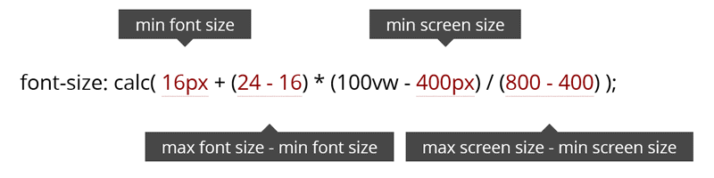
Trivia #3: I use Viewport Unit Based Typography, mainly inspired by one of Zell's talks and Vitaly Friedman's talk, using this magic formula:
Trivia #4: The site embraces the iPhone X notch. I don't own an iPhone X so I could only test this in the iPhone Simulator. I followed some of the new features highlighted on Designing Websites for iPhone X and added this meta tag:
<meta name='viewport' content='initial-scale=1, viewport-fit=cover'>
Here's a before and after comparison:
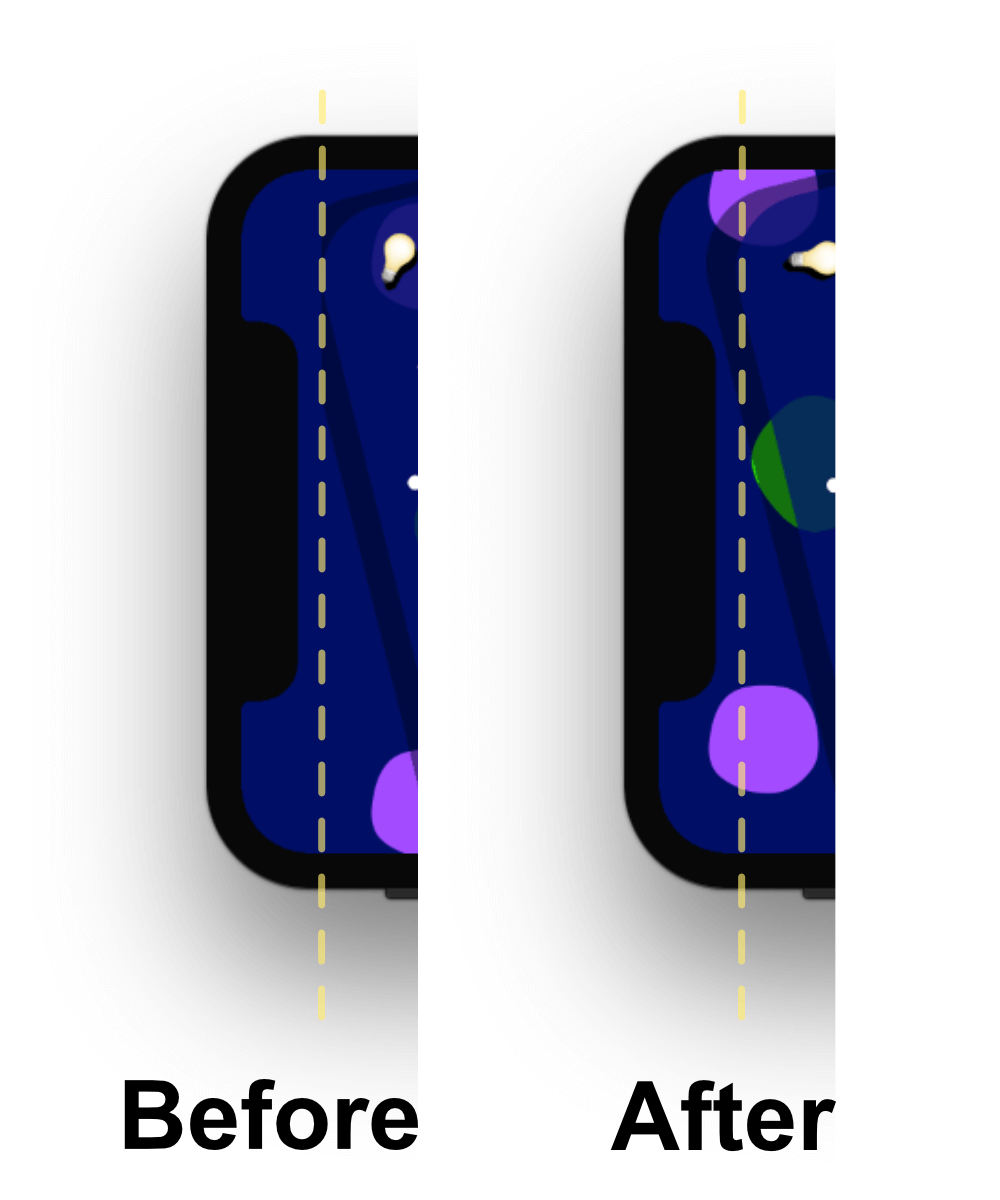
Before applying the meta tag, the site doesn't bleed to the edges, but after that, it does. Do note that the site does not respect the safe areas at all. The reasoning is… it doesn't have to, due to its diagonal scrolling nature 😎
From the very beginning, this diagonal design already works in the "dangerous" areas, even for normal rectangular screens. Think about it, technically this layout can work for any shapes of screens without the need for applying spaces for safe areas. Personally I see all this hype on iPhone X notch as a small first step towards a non-rectangular-screen future.
Trivia #5: Due to parallax-ish and titled nature of the design, the site also implements the prefers-reduced-motion media feature which is meant for folks who experience motion sickness and vertigo. It's only supported on Safari for now, on both iOS and macOS. Web developers can test this locally by turning on the 'Reduce Motion' option in Accessibility settings.
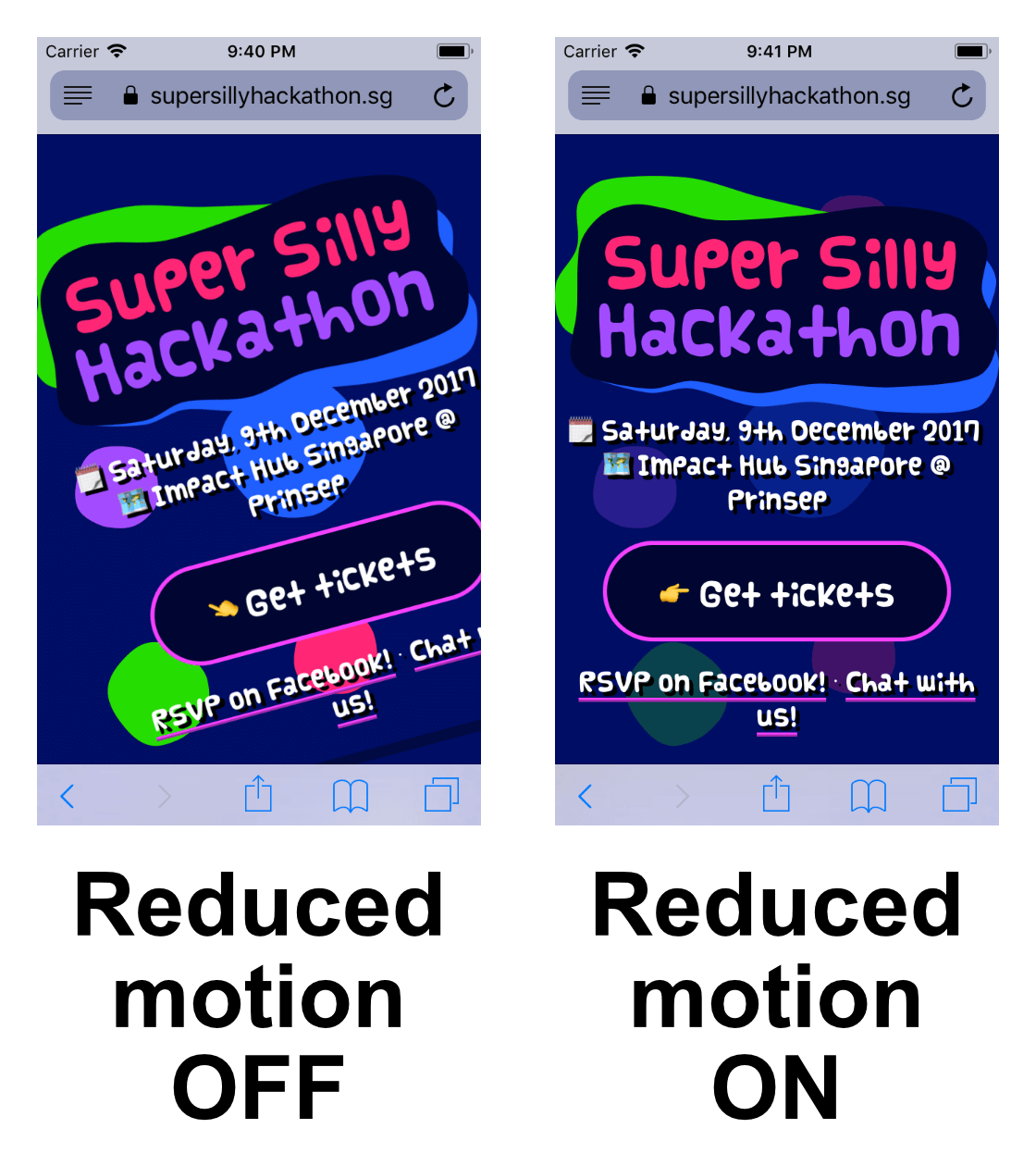
When "Reduced Motion" is turned on, I've made a few adjustments:
- Use
background-attachment: fixedto make the background image stays and reduce the "parallax" effect. - Fade out the repeating background image.
- Make the backgrounds of the sections to be less transparent.
- Un-tilt the whole content, make it vertical.
- Disable all animations and transitions.
Disclaimer: I'm not 100% sure if these help at all since I don't have vestibular disorders or any tools to test this. There is a pretty detailed post on A List Apart, Designing Safer Web Animation For Motion Sensitivity which helps much.
And… that's all! 5 trivia. Or rather, "Easter eggs"? 🤷♂️
🦄 And so it begins…
On Saturday December 9th, we organised the Super Silly Hackathon starting at 9AM for setup, registration and stuff.
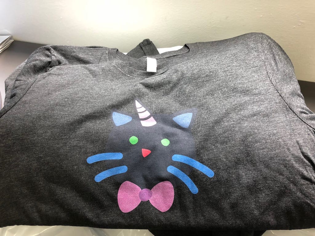
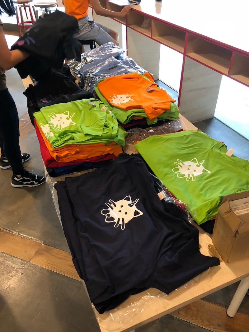
The t-shirts are super cute 😍:
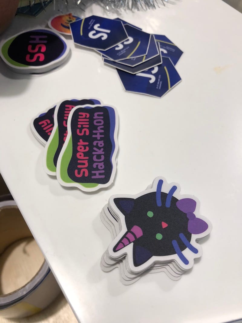
The stickers are super cute too 😍:
There are more photos on the Super Silly Hackathon Facebook page photo album! Videos of all presentations from 17 teams are also up, thanks to the wonderful Engineers.SG.
I'm also quite pleased that the Super Silly Hackathon site was featured on Hui Jing's Team 486's presentation where they serve the site, uh… locally, from a IBM PS/1 Consultant 2133 19C machine 😱
Throughout the event, everything went surprisingly well with too many swags, over-fed participants, chill co-hacking environment, and great demos & presentations with lots of enthusiasm and laughter 😊
🎬 The aftermath
It's been a pleasure to be part of this fun-filled event. Hearing positive compliments from people about my designs and the event always make me feel warm and fuzzy inside. ☺️
To be honest, I didn't really put much thought into the designs. Most of the time, I just wing it with random colors, shapes and sizes. There are no grids, golden ratio or anything. I didn't know how things will turn out or how the design will look like in real life or how people would feel about it.
It's always that sense of uncertainty and doubt, which sometimes when things go well, I'll probably say it's "pure luck".
A friend told me this, which made me paused for a while:
Not lucky, it's because of your years of experience 👍
I guess I'll accept that for now 😊